Category Archives: Stock Market

Bond Managers , Tin Hat on Please !

Ok the latest ICI data on US mutual fund has just been released and guess what ? moms and pops  are still selling bonds like it is going out of fashion and buying equities like there is no tomorrow. Hence the red squares on my chart that shows the T-Stats of the inflow/outflow for each asset buckets over diverse time horizons.us mutual funds 14082013 …and yes those  10 year bond yields are still going higher and further incentivising the laggards to come out of their bond holding….
chart

To the risk of repeating myself  we all know that there is  a massive overhang in bond holdings, so my contention is that we may have entered a spiral and that somewhere on the line we are going to see a repeat of 94…..a good old fashioned bond market crash….

cumulative inflow 14082013

Meanwhile as we gathered from the Fed minutes everyone is getting very cagey about mentioning  when they will start tapering  (or is it tampering…) ….looks like the street is about to dictate the Fed monetary policy by jettisoning  those low yielding assets for something more sexy…..

Looking good, Billy Ray!

Ok I could not help the reference to Trading Places, it has been  30 years since the movie came out after all  but this time it is not about commodities it is all about equities ! Let’s face equities are on fire and there is so much bond holdings to get rid off ahead of central banks taking their liquidity back that. That fuel is not about to run off….after all the move that we have seen in treasury is not that big….or at least there is still some ground for further retracement surely (Fig 1)…event when Bernanke tries to give us some re-insurance about the pace at will they will withdraw liquidity the direction is clear…the bond Pandora box is now officially open !

treasurybloom

Meanwhile as investor the Fed gives us little choice…. Commodities ? well we have seen some retracement but if the view remain for a muted growth it may not be necessarily the best tactical bet.  Bonds ? you skipped a paragraph surely…. Equities seems to be the only way unless you like cash with a  very low yield…or want to go for less tangible assets. Clearly the markets have moved  that way if  you take a look at Fig. 2. Ok Asia and  Latam did not do too well but Nikkei 67%  and other countries performance says it all …..

macromap1year

Fig. 1: one year performance of major stock indices.

More interestingly as per the very last data from the ICI it seems that there are no abating for bond dislike and equity appetite ! I put out a set of my usual charts for your perusal….

inflowoutflow26072013 mutual funds map 26072013

Fig 2: Mapping of Inflow/Outflow in US mutual funds

As I put the question to a well know chief economist a few months ago: Do you think money can create money ? Think a minute…after all it is surely what the Fed must be thinking ? if somehow all that private money shift from bonds to equities those companies will have  to use their new stock valuation to do something…look for new market, go into M&A mode, invest in research and development…hire a few peoples and kick start the economy ?  This is what I would expect from the CEOs that manages the companies I am invested in or else give me my money back !….Now the question is:  If all or greater part of this private money is shifting from bonds to equities what will be the effect on the dollar ? Clearly the current contention is that the significant retracement in bond markets will conduct an upshift in the US yield curve and that this will be beneficiary to the dollar strength….Most economists seem to have been lured by this scenario….I have to say that I am unsure about all this…The US Mutual fund is about US$ 19 trillions in size of which most of it is currently invested in US bonds (either US or global hedged)  and it seems from the above that there is a  justified  and significant appetite for international equities who are generally invested into on an un-hedged basis…bearing this in mind and possibly companies drawing on their rising valuations to support M&A , R&D which are likely to be foreign by nature I would think that this can significantly offset the rising US yield effect and that we could see the US$ depreciating….My feel is that we are seeing a structural asset allocation shift and that old tenets will not hold whilst we are  experiencing the renaissance of a true Equity bull market…. a  bit like in the 80’…..Looking good Billy Ray !

I Smell Bear Steak….Again !

Looks like there is no abating to for equity appetite out there. And there some are good reasons to be hungry for it…bonds won’t g bring you any decent yield whilst still bearing a massive Fed tapering tail risk. Despite the Fed floating some  reinsuring words about the measured pace at which they will withdraw the liquidity it supplied, make no mistake they will. Now the big question is: Will the market front run them and dictate the monetary policy going ahead ? Clearly if  the bond market inventory is to adjust drastically as your typical US and foreign household start to take more risks in equity markets and redeem their bond funds in the process this must also mean something for the short end of the yield curve……In that respect I am still pondering about the possible  effects of this as clearly the outstanding bond holding in US mutual funds is very large indeed not to use the word humongous.  Maybe we are not too far to discover what is the answer to this question as there seem to be clearly a general dislike for bonds and a growing appetite for equities out there. The ICI on inflow/outflow in US mutual funds illustrates well  what is taking place. The chart below shows what has been the inflow / outflow for the first half of  July, significant inflow in domestic and foreign equities and outflows in bond products….Pretty much a continuation of what happened in June, aside the inflows in domestic equities which were negative last month.

outflowinflow 18072013

Meanwhile if we look at the risk environment, the VIX trades pretty much on its long term median and a 2-state Markov regime switching model tells us that we are fairly well entrenched in a “Risk on” scenario.

regime18072013

Bearing in mind a background of  fundamentals that do not seem to be on the awful side if we are to believe Moody who changed its outlook  from negative to stable for the US, I can’t help to be still in love with equities….Bond managers, tin hat on please !

Is This What We Have Waited For ?

The answer seems to be yes  as far as what took place in June. This is the start of a  proper bond bear market, thank you Mr Bernanke. When one looks at the June data on outflow / inflow in US mutual funds just released by the ICI it becomes obvious that we are not dealing anymore with ordinary moves. The outflow in taxable bond funds was similar in term of intensity to what we observed in equity funds in October 2008. There is a smell of panic amongst bond investors and with good reason, the remaining inventory is massive and the gate is narrow. The guys at PIMCO would know about it  as they had an estimated US$ 10bn outflows last month. What is quite exciting about all this is that we have seen some inflow in international equities over the same period. This clearly looks like the onset of the shift in asset allocation  I have been so fond of over the last year and half (see my previous posts). Anyhow I thought I would display my usual charts….please look away if you are still overweight bonds…

ici 03072013flowmap 072013

The above charts shows the monthly inflow outflow in US mutual funds. The chart on the left plot the data relative to its long term median and 95% up/ interval of confidences. The data for bond is way out of scale. The chart on the left shows the T-stats of the inflow/outflow (i.e. how significant they have been) over various time period. Despite the recent inventory adjustments  bond holdings still remain very rich which would indicate that there is  further room for a significant sell off in fixed income unless the Fed shy away  from its view on tapering, better watch this job data then…..

flow and risk bond outflows june 2013

The charts above shows the outflow/inflow relative to the VIX. We have not seen much increase volatility in the equity markets, the VIX  averaged 17% in June.  We just had a minor outflows in US equities but also interestingly a notable inflow in both hybrids and international equities….This looks like the onset of an asset allocation shift to me. Finally it may be worth to start mulling over what would be the effect of further significant investing in foreign assets by US investors on the strength of the US$…..

Risk On Risk Off….

Ok despite a down session in Asia and in Europe so far this morning it is fair to recognise that the stock markets have somehow recovered over the last few sessions. I thought it would be a good idea to look at my Markov model to see in what market state we are now. I use the VIX as an input.

vix regime

An yes it  has been risk on since the 26h of June……bearing in mind the typical duration of 21 days of the “Risk On” state July should turn out as a good month unless atrocious fundamental  data hits us…..

Equtiy Market Volatility

True enough equity markets have been somehow volatile over the last month and I have to admit that my equity view has been compromised on the sort term. That being said the moves that we have seen have nothing to do with a market dislocation and there are no medium/long term reason  for me to change my view about an allocation shift and investors being about to formulate a preference for equity market as their favourite asset class for the next few years.

macromap24062013

This sudden investors twitchiness  we probably can attribute to a combination of factors: Some degree of credit crunch engineered by the Chinese authorities to slow down speculators. The expectation of Bernanke ending the overly easy monetary policy conducted by the FOMC. The significant pull out of the bond markets triggering  some risk aversion and funding need and therefore take profit on long equity positions to finance losses. Similarly a rebalancing of large funds since their bond/equity mix will have been affected by the fall in the bond valuations. I have to say however that overall I am at loss as of why this market reaction…clearly if the central bank are thinking about taking back some of the liquidity they supplied to the markets this means without any doubt that things are getting better out there. Also if one dissect Bernanke recent statement, he has made it quite clear that the FOMC decision will be driven by the economic data. So the ease of the monetary policy is there to stay with us for quite a while he is not about to hit the brakes but rather release pressure on the accelerator pedal as he put it. Anyhow in those times of market irrationality I like to look at some of my risk indicators described  in: Is it Armageddon yet ?

VIX24062013

The VIX seems to have remained close to its long term median, its own volatility was muted and my ShockIndex, a ratio of the VIX volatility divided by the VIX level 21 days earlier tell us that indeed we have seem some degree of upside acceleration in risk levels but nothing that can be classified as a market dislocation. Now the question is how long  is that market jitteriness supposed to last ? In trying to answer that question I find it useful to use a 2 states Markov Regime Switching model using the VIX as an input. The MRS establishes a transitional probability  matrix to give us an idea of which state we are in, its duration and likelihood to go into the other state. The results are shown below. The first chart shows that we have been in a “Risk off” state” since the close of the 7th of June. The model also tells us the typical duration  of this Risk off  regime should be about 11 days. Bearing in mind that we have already seen 10 market sessions  in the “Risk off” state, more joyful time should come our way….

regime switch

The second chart in the above panel shows the VIX and a forecast for the next day. Based on a close of 20.11 on the 24th we should expect the VIX to drop back by about 1.2 points during todays session…..which would be consistent with an up session in the S&P500…..

Are Equity Markets Overbought ?

There has been some talks about the equity markets being overbought as an explanation to the recent bout of volatility, so I thought I would put the recent moves in perspective. For doing so I have written a small script in R that downloads the main stock market indices from the YahooFinance Website and then estimates the T-Statistics of their daily returns over various time windows, namely 1 week, 1,3 and 6 months. The T Statistic tells us if the move observed over a given period was “normal” or not. The critical threshold used in the analysis is 95% , i.e we can reject the null hypothesis 95% of the time assuming the underlying has a normal distribution. Clearly financial markets are not normal and there are limitations to such a test, however it is my experience that it gives an information which is probably more reliable than what you would get from an RSI or any other technical indicators. The results are visualized in what I call a “stretch map”. There is one section for each time period and the size of the squares are a function of the level of the T-Stat (the bigger the T-stat the bigger the square). The map is colour coded , red for downside, green for upside. It therefore  provides an easy way to spot abnormalities.

stretch map

The map reflects well the fact that markets have been somehow sold over the last month and most particularly the like of Canada, Brazil,Mexico and Hong Kong. So it seems that is is more an EM story than a G10 one. Also when we look at the  3-month Rolling T-Stats of the stock indices it seems that none are currently in an extended territory (oversold or overbought).

rolling t stat

The Nikkei  was the only one recently to venture in what I would define as an overbought territory but it since has retraced somehow whilst preserving most of the gains delivered since the beginning of the year as can be seen from the FT Macro Map that shows the 6-month performance of major stock indices.

equity map

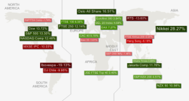
6-month Performance of major stock markets as of 17/06/2013

On any account, stock markets seem to be currently in a range that would be expected under an assumption of normality. It may well be that they still present good value ahead of the next FOMC . Seems like the good days for equity markets are not yet over by any means…
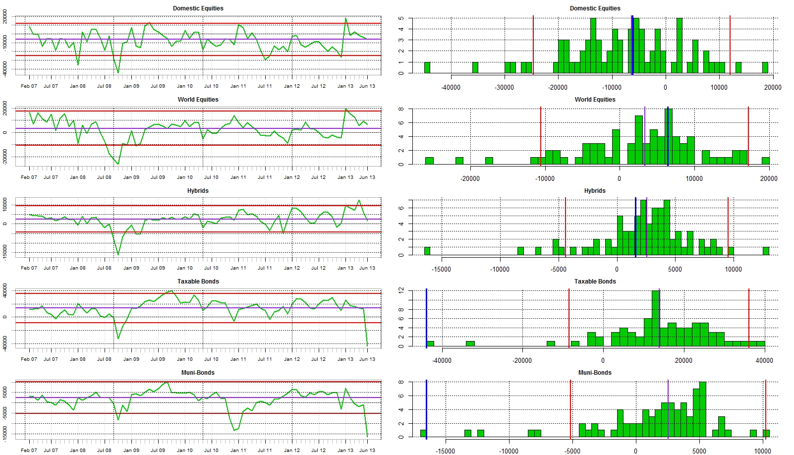
Japanese Stocks and Yen

It seems that recently we are having a media focus on the relationship between the Yen and the health of the Japanese stock market. Clearly in time of market volatility it is usual practice for analysts and alike to attempt to detect relationships and stick some explanatory variables on it. Someone has to make a living I guess…The current media contention is that the strength the Japanese Yen somehow explains the recent demises of the Japanese stock market. Clearly there may be some degree of truth in this as a stronger Yen would somehow dent the commercial margin of exporters and therefore some degree of correlation should be expected between domestic stock value and Yen (depending on the hedging approach of the underlying companies). That being said, a strong yen would also reduce the cost of importing goods and energy for Japan so overall the effect may be not as pronounced as one would expect.  The below chart shows both the evolution of the Yen and the Nikkei since 1996 and the rolling correlation over a 125-day rolling window of daily returns. There has been a strong increase in the correlation but it still remains below the statistical threshold of significance….. What we observed is also somehow atypical of the whole period where the correlation remained muted and oscillating at levels close to Zero.

correlation nikkei jpy

Rolling 125-day correlation between daily returns of the Nikkei and USD-JPY exchange rate.

Clearly the correlation test focuses on the similarities of the series deviations from their own means, so it does not tell us the story. If the Yen affects the margin of exporters/importers and subsequently the perceived valuation of their stocks, one would expect a causal relationship to be present.  So it is clearly time to go quantitative on this. In the following we look at the 125-day rolling P-values of a  Granger causality test .

pvalues yen nikkei

125-day rolling P-value of Granger Causality test.

Looking at the above results the causal relationship has been instable. True,  as of recent time the value of the Yen seems to drive (cause) the relationship but there has been periods in the past where the Yen has been  significantly strong/weak and this had no effect on the way the causality works. In summary  though there may be a bit of truth in a possible relationship  it is  clearly a weak one. To predict the Nikkei I would rather focus on other factors such as Domestic/Foreign appetite for  Japanese assets in period of renewed economic growth…..