Monthly Archives: July 2013

Quick Update on US Mutual Fund Flows….

It looks  like American investors are still switching away from bonds in July as per the recent data of the ICI. I  have put together  a few of my usual charts to visualise this. The appetite for bonds is a mirror of what it is for equities.

mutual funds map 26072013 inflowoutflow26072013

As mentioned in my previous post on the same subject my feeling is that we could see all this impact the strength of the US$ . Many economists out there are entrenched in their scenario of rising yields and GDP for the USD over the medium term with a strengthening of the US$.  Whereas I agree on the rising yields and GDP in the US, I somehow strongly disagree on the effect on the US$. Clearly the world has had a domestic bias since 2008 and this has been reflected on the risk adversity of the average US investor  asset allocation which was primarily dominated by bonds and somehow local equities. If investors become a bit more adventurous , they will start to invest more significantly in international equities (as shown in the above charts) therefore they will need to sell some US$ in the process. In that scenario it may well be that the EURUSD does not present such a bad value at 1.3280……

I Smell Bear Steak….Again !

Looks like there is no abating to for equity appetite out there. And there some are good reasons to be hungry for it…bonds won’t g bring you any decent yield whilst still bearing a massive Fed tapering tail risk. Despite the Fed floating some  reinsuring words about the measured pace at which they will withdraw the liquidity it supplied, make no mistake they will. Now the big question is: Will the market front run them and dictate the monetary policy going ahead ? Clearly if  the bond market inventory is to adjust drastically as your typical US and foreign household start to take more risks in equity markets and redeem their bond funds in the process this must also mean something for the short end of the yield curve……In that respect I am still pondering about the possible  effects of this as clearly the outstanding bond holding in US mutual funds is very large indeed not to use the word humongous.  Maybe we are not too far to discover what is the answer to this question as there seem to be clearly a general dislike for bonds and a growing appetite for equities out there. The ICI on inflow/outflow in US mutual funds illustrates well  what is taking place. The chart below shows what has been the inflow / outflow for the first half of  July, significant inflow in domestic and foreign equities and outflows in bond products….Pretty much a continuation of what happened in June, aside the inflows in domestic equities which were negative last month.

outflowinflow 18072013

Meanwhile if we look at the risk environment, the VIX trades pretty much on its long term median and a 2-state Markov regime switching model tells us that we are fairly well entrenched in a “Risk on” scenario.

regime18072013

Bearing in mind a background of  fundamentals that do not seem to be on the awful side if we are to believe Moody who changed its outlook  from negative to stable for the US, I can’t help to be still in love with equities….Bond managers, tin hat on please !

Time to buy AUDUSD ?

Ok we know that the Australian economy is intimately tied to other Asian economies and particularly China and that growth expectations for China have been dimmed by a tighter monetary policy. However  it strikes me that the Australian dollar has somehow been heavily sold over the last few month when I look at the t-stat of the daily logarithmic changes of the AUDUSD over different time windows. The first chart shows the T-stats of various exchange rates against the US$ over windows of 1 week to 6-month. The second chart shows the rolling 3-month t-stats of daily logarithmic changes of major currencies against the US$. The plotted lines are  95% interval of confidences. Clearly the AUDUSD has been significantly oversold on a statistical basis.

stretch map fx 14072013 fx rolling 3 month t stat

The Australian stock market has held  well relatively to the rest of the world . The recent global surge in equities we have seen is not driven  only by a rotation toward equities due to the fear of central bank rising their interest rates at some time in the not so distant future but also  due to expectation economic growth.

world indices 14072013The oz seems quite cheap  at 0.9050 against the Greenback….tempting….

Is This What We Have Waited For ?

The answer seems to be yes  as far as what took place in June. This is the start of a  proper bond bear market, thank you Mr Bernanke. When one looks at the June data on outflow / inflow in US mutual funds just released by the ICI it becomes obvious that we are not dealing anymore with ordinary moves. The outflow in taxable bond funds was similar in term of intensity to what we observed in equity funds in October 2008. There is a smell of panic amongst bond investors and with good reason, the remaining inventory is massive and the gate is narrow. The guys at PIMCO would know about it  as they had an estimated US$ 10bn outflows last month. What is quite exciting about all this is that we have seen some inflow in international equities over the same period. This clearly looks like the onset of the shift in asset allocation  I have been so fond of over the last year and half (see my previous posts). Anyhow I thought I would display my usual charts….please look away if you are still overweight bonds…

ici 03072013flowmap 072013

The above charts shows the monthly inflow outflow in US mutual funds. The chart on the left plot the data relative to its long term median and 95% up/ interval of confidences. The data for bond is way out of scale. The chart on the left shows the T-stats of the inflow/outflow (i.e. how significant they have been) over various time period. Despite the recent inventory adjustments  bond holdings still remain very rich which would indicate that there is  further room for a significant sell off in fixed income unless the Fed shy away  from its view on tapering, better watch this job data then…..

flow and risk bond outflows june 2013

The charts above shows the outflow/inflow relative to the VIX. We have not seen much increase volatility in the equity markets, the VIX  averaged 17% in June.  We just had a minor outflows in US equities but also interestingly a notable inflow in both hybrids and international equities….This looks like the onset of an asset allocation shift to me. Finally it may be worth to start mulling over what would be the effect of further significant investing in foreign assets by US investors on the strength of the US$…..

Risk On Risk Off….

Ok despite a down session in Asia and in Europe so far this morning it is fair to recognise that the stock markets have somehow recovered over the last few sessions. I thought it would be a good idea to look at my Markov model to see in what market state we are now. I use the VIX as an input.

vix regime

An yes it  has been risk on since the 26h of June……bearing in mind the typical duration of 21 days of the “Risk On” state July should turn out as a good month unless atrocious fundamental  data hits us…..

Are FX Markets Now Efficient ?

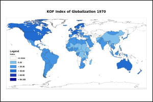
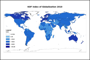
I spent a few hours yesterday reacquainting myself with the academic view at the Imperial College  first annual Foreign Exchange Conference. Most of the papers presented there were focussing on carry and crash risk. The change of  market regime observed over the last five years proved irresistible to the academically minded. Surprisingly no talk about momentum  strategies …till  one in the audience popped the question to a panel of illustrious bank economists at the very end of the conference.  Those generally presented a gloomy view of the potential of momentum strategies in generating alpha out of foreign exchange in the current environment. The supporting argument was that the markets had become somehow quicker at translating information and that therefore fewer potential for inefficiency remained. I guess it would be difficult to argue against the fact that markets have become more integrated over the years. This is obviously  due to the advance of communication and transactional technology. Also economies have become generally more open therefore facilitating capital flows. A good way to visualise this is to look at a map of the Globalisation Index compiled by the KOF. The Globalisation index relies on various metric of  economic, social, technological, cultural, political, and ecological data to tell us how integrated and globalised the world is.  From the two charts below you can see that world is somehow more integrated than what it was 40 years ago.

index_1970index_2010

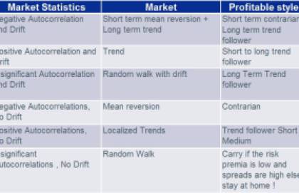
Following this  I thought that it would make sense to look at how the FX markets have behaved in terms of inefficiency over the long term. I did this by classifying the statistical behaviour of 45 exchange rates derived from the G10 US$ exchange rates. To classify them I looked at the 95% significance level of the first autocorrelation and  of the drift over a rolling window of 250 daily logarithmic returns over the period  January 1971  to 2013. I created different bins which I then aggregated under three sub categories, namely Trend, Mean-Reverting and Random.  the Bins are defined as in the following:

classification

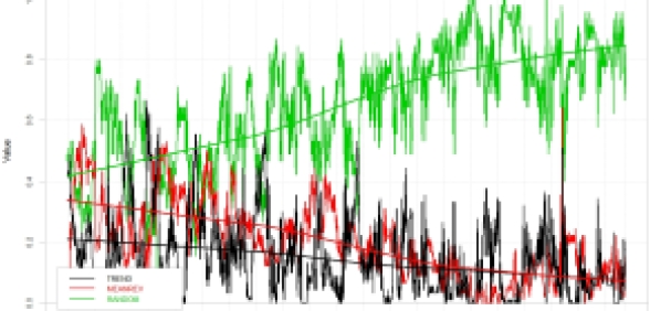
Over the whole sample the results shows that the 45 exchange rates have been on average  random 64 %  of the time, mean reverting 20 % of the time and trending  16 % of the time. This means that most of the time it has been very difficult to forecast currencies but that there has been some opportunities to deliver value. What is less encouraging is that the Random behaviour as surged as time went. If we look at the classification over the last 5 years of data it is: 84% random, 9 %  mean reverting and 7 % trending.

classification 2Obviously in this analysis the membership of one currency can change from one period to another and therefore support the argument for more shorter term opportunities. Also true enough in my definition of random ( no significant drift or autocorrelation)  one could generate returns if the market risk premia is low and the interest rate spread is high…..clearly this has not been the case over recent time, market risk as been volatile and spreads have tightened due to the ultra loose monetary policy lead by central banks.  On the topic of momentum the results delivered by the AFX  a naïve momentum strategies which was designed in 1996 has been resilient  and delivered some degree of positive returns though this as arguably diminished  toward zero over the last 5 years.

afx

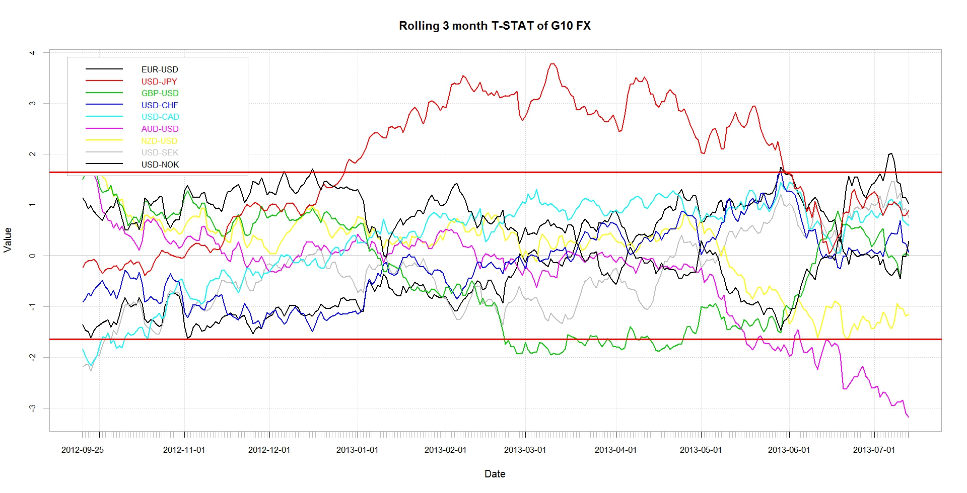
This may explain in part why active currency managers have had a tough time over the last few years.  So are FX market becoming more efficient ? yes certainly ! Does this means the end of systematic trading or active management as a whole? no certainly not !  Clearly there are some opportunities  for profits  in foreign exchange to generate value. The recent move in the USDJPY and other Yen crosses is a good illustration of this. Also it is likely that central banks will look forward to adjust their monetary policies as the global economy recover. This will create further opportunities in both the carry and momentum space as spread will widen and currency become more directional when interest rates changes.  However I think that for an investment process to capture those opportunities greater time  and effort will need to be spent  R&D on the subject of dynamic style allocation and risk budgeting. Meanwhile other managers relying purely on one specific style will slowly but surely disappear….Dynamic Multifactor Models will remain the essence of good alpha…..