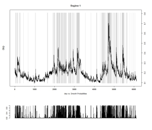
As market risk has been trading on the low over the last few months I thought that I would post a few charts of mine. First looking at the VIX as a measure of financial market risk we are indeed trading at relatively low level, though we are still a few points away from the 9.31 the lowest ever close that printed on the 22nd of December 1993 . The two states Markov regime switching remains clearly on risk seeking mode.
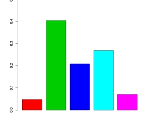
Contributing to this low volatility has been the massive inflows that we have seen on equity markets. However I would not call this level abnormal, the chart above start from January 1990 and show that we have indeed experience long period of low volatility in the past. The chart below shows the significance of inflows/outflows in US mutual funds tracked by the ICI . The chart on the left shows the T-stat of the inflows for the main asset classes over various time horizons. It is clear that the preference has been for equities, and this with good reasons as discussed in my previous posts. So far in the US alone we have seen close to USD 120 billions of new inflows in US mutual funds.
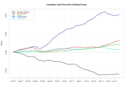
Out of this, as shown by the right hand chart, close to 40% went into Foreign equities , only 5% into US equities and 21% in hybrids. if we assume a 60/40 benchmark this means an extra 8% into equities. Therefore potentially 53% of the 120bn invested went into equities. This is somehow in decline in respect of what we have seen in the first half of 2013 where 162bn went into US mutual funds, with an estimated 62%allocated to equities. However this is without any doubt a contributing factor to the low level observed in the VIX. Clearly central banks monetary policy and also the implication for the bond market of an exit scenario on the back of better economic fundamentals has somehow been behind the great rotation that started now a couple of years ago. The last chart showing the cumulative inflows in the main asset classes indicates that there is still some way to go….I ll stick to equities as usual….


