Category Archives: Bonds

US MUTUAL FUND FLOWS REPORT UPDATE

Wed Jun 01 20:21:38 2016

Fund flows are important as they reflect the general investor preference for a specific asset class given current and expected economic conditions and market risk. They may also highlight non-sustainable market positioning. The ICI in the US tracks about 98% of the inflows and outflows in US mutual funds and makes its data freely available on its website. The following is a summarised report of the data it publishes every Wednesday. The first charts shows the cumulative inflows/outflows in each of the asset classes buckets since 2007

plot of chunk cumulative

During the month of May we have seen flows of US$ -14.5Bn in Domestic equities,US$ -0.404Bn in international equities, US$ -0.618Bn in Hybrid products,US$ 7.66 Bn in taxable bond funds and US$ 7.19Bn in non taxable bond funds.

plot of chunk month to date
The Charts below shows the distribution of the US$ -205Bn that have flowed into US$ Mutual funds over the last 12-month.

plot of chunk distribution

The below charts show the monthly inflows/outflows for each type of fund and plot them both within their 95% confidence intervals and also relative to their historical distribution. This provides a level of information in respect of how “out of line” or not the current month inflows/outflows may be relative to their past history. In the distribution charts The current month is highlited in blue whereas the vertical red lines represent the 95% confidence intervals.

plot of chunk flowdistribution

The chart below plot the inflows/outflows T-statistics for each of the funds cathegories considered. The Map chart provides information for period ranging from 2 years to 3 months.The greater the square the more important the inflows (green) outflows(red) over a given period.

plot of chunk flowmap

US MUTUAL FUND FLOWS REPORT UPDATE

Thu May 12 22:34:40 2016

Fund flows are important as they reflect the general investor preference for a specific asset class given current and expected economic conditions and market risk. They may also highlight non-sustainable market positioning. The ICI in the US tracks about 98% of the inflows and outflows in US mutual funds and makes its data freely available on its website. The following is a summarised report of the data it publishes every Wednesday. The first charts shows the cumulative inflows/outflows in each of the asset classes buckets since 2007

plot of chunk cumulative

During the month of May we have seen flows of US$ -2.36Bn in Domestic equities,US$ -0.649Bn in international equities, US$ -0.308Bn in Hybrid products,US$ 2.03 Bn in taxable bond funds and US$ 1.5Bn in non taxable bond funds.

plot of chunk month to date
The Charts below shows the distribution of the US$ -199Bn that have flowed into US$ Mutual funds over the last 12-month.

plot of chunk distribution

The below charts show the monthly inflows/outflows for each type of fund and plot them both within their 95% confidence intervals and also relative to their historical distribution. This provides a level of information in respect of how “out of line” or not the current month inflows/outflows may be relative to their past history. In the distribution charts The current month is highlited in blue whereas the vertical red lines represent the 95% confidence intervals.

plot of chunk flowdistribution

The chart below plot the inflows/outflows T-statistics for each of the funds cathegories considered. The Map chart provides information for period ranging from 2 years to 3 months.The greater the square the more important the inflows (green) outflows(red) over a given period.

plot of chunk flowmap

A World of Debt

The BIS provides much information about the indebtedness level of countries. The below interactive map shows what was the total outstanding debt in billion  of US Dollars  for each of the countries that are surveyed by the BIS as of December 2014 .

US MUTUAL FUND FLOWS REPORT UPDATE 18-02-2015

Wed Feb 18 15:30:28 2015

Fund flows are important as they reflect the general investor preference for a specific asset class given current and expected economic conditions and market risk. They may also highlight non-sustainable market positioning. The ICI in the US tracks about 98% of the inflows and outflows in US mutual funds and makes its data freely available on its website. The following is a summarised report of the data it publishes every Wednesday. The first charts shows the cumulative inflows/outflows in each of the asset classes buckets since 2007

plot of chunk cumulative

During the month of February we have seen flows of US$ 3.51Bn in Domestic equities,US$ 2Bn in international equities, US$ 1.75Bn in Hybrid products,US$ 7.44 Bn in taxable bond funds and US$ 1.66Bn in non taxable bond funds.

plot of chunk month to date The Charts below shows the distribution in percentage terms of the US$ 63Bn that have flowed into US$ Mutual funds over the last 12-month.

plot of chunk distribution

The below charts show the monthly inflows/outflows for each type of fund and plot them both within their 95% confidence intervals and also relative to their historical distribution. This provides a level of information in respect of how “out of line” or not the current month inflows/outflows may be relative to their past history. In the distribution charts The current month is highlited in blue whereas the vertical red lines represent the 95% confidence intervals.

plot of chunk flowdistribution

The chart below plot the inflows/outflows T-statistics for each of the funds cathegories considered. The Map chart provides information for period ranging from 2 years to 3 months.The greater the square the more important the inflows (green) outflows(red) over a given period.

plot of chunk flowmap

Is The Fed Changing Its View About Inflation ?

Yesterday in her  Semi-annual Monetary Policy Report to the Congress,  Chairman  Janet Yellen  stated the following: “If the labor market continues to improve more quickly than anticipated by the Committee… then increases in the federal funds rate target likely would occur sooner and be more rapid than currently envisioned.”  However Treasury yields  have barely moved and the dollar appreciation  again the Greenback remained muted . The Euro depreciated only by 0.6% against the US Dollar since her speech.  As shown from the chart below though the dollar against a broad basket of currencies is fairly well priced this is not the case for 10-year yields. US 10 year yierld traded weighted Against all odds, Yellen  seems to have managed to contain market expectations yet again. This is quite outstanding when one looks at the hard data. Unemployment is clearly below the 6.5%  Fed target level. Also the rise in industrial production is quite telling of  an even lower unemployment rate in the months to come. unemployement USINDPRO

It is true that we have not yet seen much wage inflation in the us. The annual rate of increase in the average hourly earnings remains below 2% as shown below.  Wages remain dampened by the spare labour capacity. average earnings Clearly the Fed has accepted to remain behind the curve for quite a while  so  as not  to compromise any renewed  growth  in the US. The current low level of the Fed fund rate is a good illustration of  this. Fed Fund Contributing to a generally  dim view on the US economy by Fed members  could be that many forecasting models use 2×10 spreads as an input to forecast GDP. The abnormally ultra-low fed fund and therefore current steepness of the curve  could contribute to why  the Fed  growth forecasts may not be as accurate as should be.  After all even the IMF got it wrong with its growth forecast for the UK. 2x10It is now noticeable that over the last few months,  Inflation has crept  above the 2% target of the fed as indicated by the below chart. This is not surprising as trend in consumerism and aptitude of  price increase  is somehow function of  employments and wages earned. Though arguably not yet at an alarming level it will be interesting to watch out how the Fed react to further developments. US CPI So is the Fed starting to worry about inflation ? Plotting a Word Cloud of Yellen’s  speech it is indeed quite clear that Inflation is the central issue …..   yellen speechBearing in mind the above  it will be interesting to watch out for changes in the pattern of the inflows/outflows in US mutual funds. My thought is that we could see a resuming of the exit of bond products which was compromised by the ultra dovish tone adopted by Yellen when she took office. As mentioned in my previous post , the relative inflow/outflow in US versus foreign equities  could also have a perverse effect on the valuation of the US Dollar. High rates are not necessarily a long term driver of currency , capital flows are more important.  As a remainder of the current trends in US mutual funds  below are  couple of charts of my previous post. They show the distribution of the inflows/outflows in US mutual funds by asset class since the beginning of the year and the cumulative   flows in domestic versus foreign equities products since 2007. distribution inflows 2014cumulative flows I’ ll stick to my Long global equities and short dollar view…..

Long Equities as Usual

As market risk has been trading on the low over the last few months I thought that I would post a few charts of mine. First looking at the VIX as a measure of  financial market risk we are indeed trading at relatively low level, though we are still a few points away from the  9.31 the lowest ever close that printed on the 22nd of December 1993 .  The  two states Markov regime switching remains  clearly on risk seeking mode.

vixregime

Contributing to this low volatility has been the massive inflows that we have seen on equity markets.  However I would not call this level abnormal, the chart above  start from January 1990 and show that we have indeed experience long period of low volatility in the past. The chart below shows the significance of  inflows/outflows in US mutual funds tracked by the ICI . The chart on the left shows the T-stat of the inflows for the main asset classes over various time horizons. It is clear that the preference has been for  equities, and this with good reasons as discussed in my previous posts. So far in the US alone we have seen close to USD 120 billions of new inflows in US mutual funds.

flowmap05062014 inflow dist

Out of this, as shown by the right hand chart,  close to 40% went into Foreign equities , only 5% into US equities and   21% in hybrids. if we assume a 60/40 benchmark this means an extra 8% into equities. Therefore  potentially 53% of the 120bn invested went into equities.  This is somehow in decline in respect of what we have seen in the first half of 2013 where 162bn went into US mutual funds, with an estimated 62%allocated to equities.  However this is without any doubt a contributing factor to the low level observed in the VIX. Clearly central banks monetary policy  and also the implication for the bond market of an exit scenario on the back of better economic fundamentals has somehow  been behind the great rotation that started now a couple of years ago. The last chart showing the cumulative inflows in the main asset classes indicates that  there is still some way to go….I ll stick to equities as usual….

cumulative


Not Quite the Berezina…

Ok I may have been a bit facetious in my last blog in regard of  my view on the impact of Russia and China on the Financial markets. This clearly has come back to haunt me, at least this is what I am being told by the mark to market of my stock portfolio.  Despite the ensuing underperformance of global stock markets it is quite interesting to note how resilient the “Index of Fear”, namely the VIX. The change in market volatility has been quite tame so far.  Maybe this gauge of fear is not what it used to be….It may well be also that the market was somehow over insured  against risk. Anyhow my point is that what we are seeing now  is  not a capitulation or dislocation but rather an orderly adjustment of market portfolio risk by investors.

indexmap  risk

After this more volatile few weeks I though I would look at my favourite data, namely the US mutual funds flow data released by the ICI. Surely the Ukrainian story should have had some implications on investors perception of stock markets and this should be reflected in their investment flows. From what we can see from the below charts, this has had little to no effect so far. Investors are still buying equity “en masse”, with a preference for international equities. This as I said in past blogs may be one of the factors keeping the lid on a dollar rally as those flows tend to be un-hedged by nature.

cumulative flows flowmap

The only notable difference is the renewed interest in bond products that took place since the investiture of Yellen at the helm of the Fed. Clearly her dovish tone has helped in that respect. However with better numbers across the board coming out from the US, I am not so sure this will be a lasting proposition….I still stick to my view that the global economy is thriving  and that equities should therefore be the favourite asset class for the next cycle, and I will therefore bear with the geopolitical noise an pains a  bit longer.


Forget about Putin and China !

Ok it It has now been a month since my last posting since I was busy doing some academic work  on the side. Anyhow what an interesting time we have had since the 12th of February…Putin venturing into Crimea, China releasing weak numbers, copper  collapsing etc….Anyhow it seems that the markets have taken cue to this and that equity markets have retraced. The index map charts  below shows the level of significance (T-stats) of the moves observed for major stock indices over various time period. It has been tough over the last week and the main driver was probably the referendum in Crimea due the 16th of March…..

Rplot01

Interestingly enough despite those retracements the  VIX has barely moved and my 2 states Markov regime switching model remains entrenched in a more rosy picture of the world.

riskvixmarkov

So it is time again to see what inflows/outflows we have had in US mutual funds by looking at the Investment Company Institute data and here below are the usual chart showing the significance of those flows over various time horizon as well as the cumul since 2008. Not much change in what has been seen over the last two years….Buy global equities and sell bonds…

Rplot01 cumulflow

Over the last month close to USD 50bn went into equities whilst  USD 19bn came out of Bond products. I ll stay with the crowd…R.I.P PIMCO…..

2014 …Same All Same All…But Only Faster…

Ok it looks like 2013 finished on a theme of international equity buying and selling of bonds. Or so tell us the latest  data release of the US jmutual fund flow data from the ICI . The usual charts are in the below.

inflow 31122013

Cumulative flows

flowmap

And yes we still have a lot of stale bond investments to clear out there so on an inventory basis bearing in mind the withdrawal of liquidity that central banks are about to embark on and the effect it will have on bond valuations I will stick to my long view on equities and short bonds. I think the telling factor for 2014 will be the acceleration of the shift in asset allocation ( I ll think of a few charts to visualise this…) ….It may even think about building up further my holdings of financial equities….


Mark My Words: It Is Just The Beginning Of The Bloodbath For Bonds !

Quite clearly the last Fed meeting of the year was  important. We got the long awaited  announcement that the purchase of Treasuries and MBS would be reduced. The rate of 10 billions  a month at which it decided to decrease its security purchase was mild enough to demonstrate that the Fed meant to remain accommodative and that its main concerns were the relatively high unemployment rate and the stubbornly low inflation rate, as shown in the word cloud of the Fed Statement. fed cloud 18122013

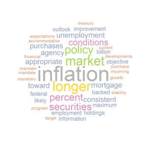
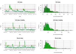
To put in context  how mild this reduction of security purchase by the Fed is, it is worth bearing in mind that US mutual fund holders have been redeeming from bond funds at an average rate of 23 billions a month over the last seven months. This probably supports my contention that the Fed will accept to lag the market shift in asset allocation so as not to send those long term rate flying… but ultimately the 10 year US rate is more likely to trade close to 4% than 2% within the next year or so as private sector redemptions and government withdrawal of liquidity  will ineluctably  bear on bond valuations. So we will see further steepening in yield curves. The reason behind the price dynamic is clearly driven by growth expectations which are rationalised by the continuous decrease we have observed in US unemployment and general pick up in economic activity.  Anyhow it seems that the market took the news very well  since we have seen a small upside in equity markets and the VIX  has been holding at what once would have been deemed insanely low levels as shown in the below chart.

vix20122013

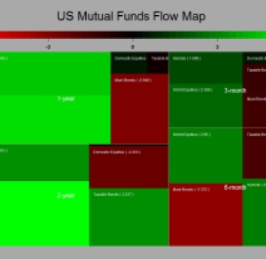
As of why the VIX remain so low,  my theory is that the dynamic is supported by the significant inflows we are seeing in the equity markets. selling short the VIX should indeed correlate with a long position in equity markets.  Anyhow  the last batch of data has just been released by the ICI and guess what ? It is redemption time again for those fixed income funds. Somehow the Fed meeting which acted as a beacon for the Roubinni’s of this world and black swan watchers proved to be a damp squib because of the modest decrease in security purchase announced. Not surprisingly there were a few outflows for domestic equity funds ahead of the Fed release and the outflows in bonds was as usual negative (as would be consistent with a decrease purchase by the Fed). It is worthwhile noting however that the flows toward global equity funds remained significantly positive. This  ultimately lead me to thing that this will put pressure on the US$ particularly against the EURO because of the country weighting in MSCI and other equity benchmarks.   Below are the usual map charts and cumulative charts.

flow map 201220133

As mentioned in the above the inflows into equities and outflows from bond products are taking place in a relatively low risk environment (as expressed by the VIX).  I find this interesting as it is consistent with an orderly shift in asset allocation. We are not talking about the kind of asset shift we have seen in 2007/2008. It was then clearly driven by a strong risk adversity and therefore not a long lasting proposition. The chart below illustrates well the new flow dynamic we are experiencing.

inflow outflow vix

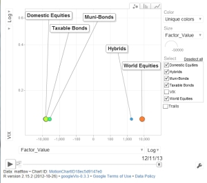
This kind of configuration tends to occur when an equity bull markets is taking hold. So my view remain stubbornly unchanged and you are better to get used to the above charts….the bloodbath for bonds has just started it will be slow and agonising…I will stay long equity Beta.