Category Archives: Fed Policy

Impact of the Fed’s annoucements on the S&P500

Ok I have meant to produce the following analysis for a long time and now that the market is focussing on the next Fed meeting I feel that it might be the right time to release a first version of this. In summary, the following report shows what were the cumulative returns of the S&P500 index 10-day prior and following the FOMC meetings. It also shows how the delivered volatility of the S&P500 changed on average prior and after the Fed annoucements. I have split my analysis to show the market reaction as for when when there was not change in the Fed Funds target rate, when a cut in the rate occured and when there was hike. I will provide an analysis showing what was the impact on the US trade weighted index and the VIX in further posts…

From 1982-10-05 to 2015-10-28there was 352 Fed meetings.Out of those 33 meetings translated in an increase in the target rate and 33 in a cut. The below charts shows when those took place and also the distribution fo the changes in rate.

plot of chunk unnamed-chunk-2plot of chunk unnamed-chunk-2
The charts below show the S&P500 response for all of the Fed’s meetings and the delivered volatility 10 days prior and after the meetings.

plot of chunk unnamed-chunk-3
The charts below show the S&P500 response and delivered volatility for all of meetings where a cut occured

plot of chunk unnamed-chunk-4
The charts below show the S&P500 response and delivered volatility for all of meetings where a hike occured

plot of chunk unnamed-chunk-5

The charts below show the S&P500 response an delivered volatility for all of meetings where there was no change in the Target rate.

plot of chunk unnamed-chunk-6

As a general remark it would seem that the volatility of the S&P is higher prior the meeting and tapper down after the Fed annoucement (this is not as visible for the cuts and hikes. This is probably the result of the low level of observations in the respective samples…). There is no real clear pattern in which way the S&P500 response to the annoucnements be them hikes, cuts or no change….

Is The Fed Changing Its View About Inflation ?

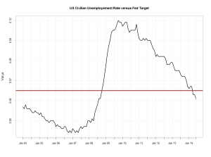
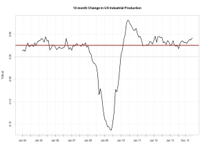
Yesterday in her  Semi-annual Monetary Policy Report to the Congress,  Chairman  Janet Yellen  stated the following: “If the labor market continues to improve more quickly than anticipated by the Committee… then increases in the federal funds rate target likely would occur sooner and be more rapid than currently envisioned.”  However Treasury yields  have barely moved and the dollar appreciation  again the Greenback remained muted . The Euro depreciated only by 0.6% against the US Dollar since her speech.  As shown from the chart below though the dollar against a broad basket of currencies is fairly well priced this is not the case for 10-year yields. US 10 year yierld traded weighted Against all odds, Yellen  seems to have managed to contain market expectations yet again. This is quite outstanding when one looks at the hard data. Unemployment is clearly below the 6.5%  Fed target level. Also the rise in industrial production is quite telling of  an even lower unemployment rate in the months to come. unemployement USINDPRO

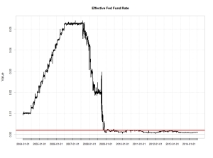
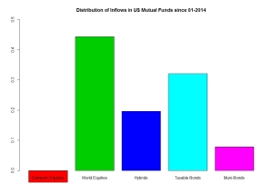
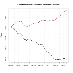
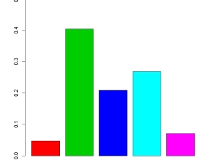
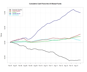
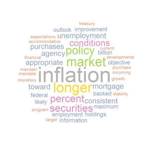
It is true that we have not yet seen much wage inflation in the us. The annual rate of increase in the average hourly earnings remains below 2% as shown below.  Wages remain dampened by the spare labour capacity. average earnings Clearly the Fed has accepted to remain behind the curve for quite a while  so  as not  to compromise any renewed  growth  in the US. The current low level of the Fed fund rate is a good illustration of  this. Fed Fund Contributing to a generally  dim view on the US economy by Fed members  could be that many forecasting models use 2×10 spreads as an input to forecast GDP. The abnormally ultra-low fed fund and therefore current steepness of the curve  could contribute to why  the Fed  growth forecasts may not be as accurate as should be.  After all even the IMF got it wrong with its growth forecast for the UK. 2x10It is now noticeable that over the last few months,  Inflation has crept  above the 2% target of the fed as indicated by the below chart. This is not surprising as trend in consumerism and aptitude of  price increase  is somehow function of  employments and wages earned. Though arguably not yet at an alarming level it will be interesting to watch out how the Fed react to further developments. US CPI So is the Fed starting to worry about inflation ? Plotting a Word Cloud of Yellen’s  speech it is indeed quite clear that Inflation is the central issue …..   yellen speechBearing in mind the above  it will be interesting to watch out for changes in the pattern of the inflows/outflows in US mutual funds. My thought is that we could see a resuming of the exit of bond products which was compromised by the ultra dovish tone adopted by Yellen when she took office. As mentioned in my previous post , the relative inflow/outflow in US versus foreign equities  could also have a perverse effect on the valuation of the US Dollar. High rates are not necessarily a long term driver of currency , capital flows are more important.  As a remainder of the current trends in US mutual funds  below are  couple of charts of my previous post. They show the distribution of the inflows/outflows in US mutual funds by asset class since the beginning of the year and the cumulative   flows in domestic versus foreign equities products since 2007. distribution inflows 2014cumulative flows I’ ll stick to my Long global equities and short dollar view…..

US Mutual Funds Flows Update: Investors Still Favouring International Equities

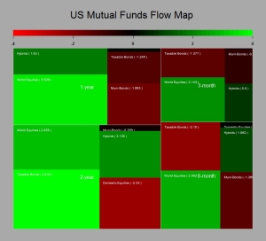
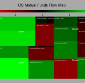
As it has been a while  since I have posted something and my broken arm is no longer a valid  excuse , I thought I would provide an update on  trends  in US mutual funds flows. To my surprise, bearing in mind the current geopolitical risks,  there has not been much change over the last few weeks. US investors have held onto  their preference for international equities whilst staying shy from the US stock markets. Also the trend of inflow into bonds   remained despite growing expectation of the Fed becoming more hawkish down the line. The map below shows the T-stats of the inflow/outflows across different time periods.

FLOWMAP

Clearly the dovish tone adopted by the Fed  has helped both the trend in equities and also bonds.  The question is how long  can this last ? Clearly the strengthening  observed in the US job market demonstrates that significant growth has rooted. Down the line this will create an issue for the fed, as managing rate expectations  whilst turning away from a dovish stance may prove challenging.  To me the most interesting point of all  is how US investors voted with their money. As can bee seen from the below charts they have stayed well away from US equities whilst investing in Foreign equities. In fact out of the US$ 133 bn invested in US mutual funds  44 %  (US$ 59 bn) went into  foreign equities  so far this year, whilst  US$ 5bn came out from US Stocks funds.

cumulative flows  distribution inflows 2014

As said in my previous posts I believe that what we are seeing could be a good explanatory variable as of  why the dollar has been so weak and particularly against the EURO despite the monetary expectation in Europe and the US. Bearing in mind the current market positioning and central bank flows it may well be that the  EURUSD is currently undervalued….


Long Equities as Usual

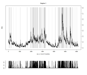
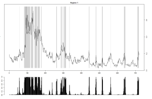
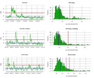
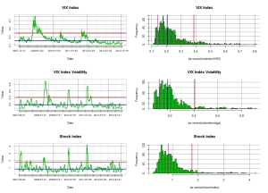
As market risk has been trading on the low over the last few months I thought that I would post a few charts of mine. First looking at the VIX as a measure of  financial market risk we are indeed trading at relatively low level, though we are still a few points away from the  9.31 the lowest ever close that printed on the 22nd of December 1993 .  The  two states Markov regime switching remains  clearly on risk seeking mode.

vixregime

Contributing to this low volatility has been the massive inflows that we have seen on equity markets.  However I would not call this level abnormal, the chart above  start from January 1990 and show that we have indeed experience long period of low volatility in the past. The chart below shows the significance of  inflows/outflows in US mutual funds tracked by the ICI . The chart on the left shows the T-stat of the inflows for the main asset classes over various time horizons. It is clear that the preference has been for  equities, and this with good reasons as discussed in my previous posts. So far in the US alone we have seen close to USD 120 billions of new inflows in US mutual funds.

flowmap05062014 inflow dist

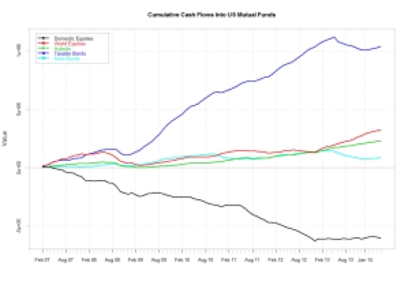
Out of this, as shown by the right hand chart,  close to 40% went into Foreign equities , only 5% into US equities and   21% in hybrids. if we assume a 60/40 benchmark this means an extra 8% into equities. Therefore  potentially 53% of the 120bn invested went into equities.  This is somehow in decline in respect of what we have seen in the first half of 2013 where 162bn went into US mutual funds, with an estimated 62%allocated to equities.  However this is without any doubt a contributing factor to the low level observed in the VIX. Clearly central banks monetary policy  and also the implication for the bond market of an exit scenario on the back of better economic fundamentals has somehow  been behind the great rotation that started now a couple of years ago. The last chart showing the cumulative inflows in the main asset classes indicates that  there is still some way to go….I ll stick to equities as usual….

cumulative


A Storm In a Tea Cup !

Ok it has been a couple of eventful weeks if you were invested in equities be them from developed markets or emerging markets. Clearly the scaremongering of analysts and journalists paid by the line rather than the true profit they generate has somehow fed into the volatility and sudden lack of rationale of markets. We have seen a spike in the VIX and  as indicated by a 2-state Markov regime switching model a risk off scenario. As mentioned in my previous post, it is worth bearing in mind that those periods of risk aversion tend to be short and somehow provide good ground for opportunities.vixregimes

True  the sell off  somehow pushed most equity markets in the red. But if one take time to look at the moves that unfolded they have not been really out of tune from what could be expected from the median risk of equity markets. By that I mean that if you assume that equity markets have  typically an annualised volatility of 20% this means that the monthly move expected  under a normal distribution assumption should be tantamount to 20% * 1.6450 /sqrt(12) = +/- 9% . So true enough some of the markets such as Japan and Chile have gone  somehow out of this range as shown in the below chart. But I would argue that we are not miles away and that there is no reason to panic because  a herd of unknown analysts have come out from the woodworks forecasting the end of the world as we know it…..a loss of nerves is is to be expected every time we have a down move of more than 5%.

untitled

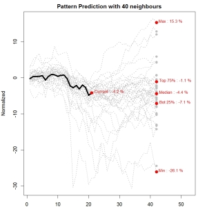
In respect of the S&P500  the move we have seen over the last 21 days is indeed pretty much middle of the road as a close neighbour analysis using daily data back to 1980 demonstrates. From there the scenarios are quite varied…

pattern

So let’s go back to the catalyst of those financial ripples, the Fed policy an its impact on global liquidity. Well , there is nothing new about the Fed reducing its liquidity supply. We have been told last year what was the plan and you are better getting use to it ! Bottom line is that things are going very well in the US, the data is clearly indicating a strong recovery which is logically feeding into both the housing markets and the equity markets. So it may well be that the liquidity which is smoothly withdrawn  by the fed will in fact be replaced by investment flows and a growing trading activity between the developed world and emerging market countries as those economies recover and re-leverage. Perversely this could have a negative effect on the dollar as it will mean more cross border flow toward new international opportunities by US investors and corporates. Also as  growth come back and US withdraw some of its liquidity it is likely that some of the EM countries will draw on there reserves  which is predominantly made of US$ to stimulate their own economies. Anyhow it is worth looking at the latest batch of data on inflow in US Mutual funds as it now cover the recent period of volatility.

inflowversus VIXflowmap

And guess what…. investors are still buying international and domestic equities significantly. Bonds flows have somehow recovered ever so slightly….though my view is that they will probably shift back to negative for the reasons presented in my previous posts…..So I think I ll keep re-investing those dividends in financial equities for a while..

When the Tough Gets Going……

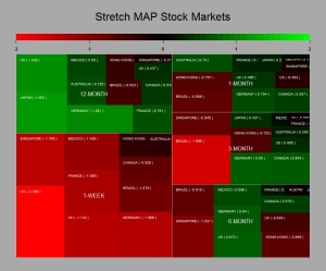
Ok everything was going well and then suddenly the market decided to remind itself that the Fed was in tapering mode and that this should feed into EM liquidity.  Bearing in mind what the Fed told us about the tapering early December and that overall US  data has been on the good side, I am not so sure this FOMC release should have been a surprise to anyone. Anyway it has been a bit of a bloodbath over the last week  in preparation of the release as can be seen from the below charts. The first one shows the T-Stats (i.e mean return/standard deviation * sqrt(sample size -1)) over various time horizons for major equity markets whereas the second one shows the components of the FTSE 100, my current playground. The greener the best and the redder the closer to hell for the bulls…

stock markets      ftse100all

So what is the driving  reason to sell equities and “risky assets”  aside generating fees and commissions for some ? Clearly the market does not seem to be  at its most rational state. The Fed tapering as mentioned in my other posts should be good news since it is driven by the bettering of the US economy. Even things seems to get better in some part of Europe. Ok China is slowing down  as per its latest data points but this is engineered  and certainly not an abrupt surprise. Anyhow the Chinese government has ample reserves to steer their economy up if they wanted and Japan is really picking up at long last.  Looking at my favourite data which track US mutual funds inflow/outflows it looks like recent events have not slow down the appetite of US investors for international equities. In fact we carry on pretty much on the same established trends of last year. Buy equities and stay away from bonds….and the bond inventory is humongous which does not bode to well in a cycle were rate3s are likely to go up at one stage…R.I.P PIMCO and alike….

usmutualfunds cumulative flows

So what to do when its getting tough ? Clearly the world is not any different than what it was in the last quarter of 2013…The global economy is slowly but surely re-leveraging and the central bank will remain accommodative potentially leading us to an inflation surprise down the road. Though we admittedly have some time before we get there as we clearly need the consumers to reach his wallet in a more significant fashion. The risk environment is in safety mode as shown by a Markov 2-state regime switching model. And yes the VIX the so called index of fear as spiked….

regimes    vix

However as a quick observation , historically those period of   loss of nerves by market participants  are not very long lasting and tend to open new opportunities. Now the Fed has released  its statement it is time to buy back those stocks….hopefully at a lower cost after fees….Else just hang on to your longs….

Mark My Words: It Is Just The Beginning Of The Bloodbath For Bonds !

Quite clearly the last Fed meeting of the year was  important. We got the long awaited  announcement that the purchase of Treasuries and MBS would be reduced. The rate of 10 billions  a month at which it decided to decrease its security purchase was mild enough to demonstrate that the Fed meant to remain accommodative and that its main concerns were the relatively high unemployment rate and the stubbornly low inflation rate, as shown in the word cloud of the Fed Statement. fed cloud 18122013

To put in context  how mild this reduction of security purchase by the Fed is, it is worth bearing in mind that US mutual fund holders have been redeeming from bond funds at an average rate of 23 billions a month over the last seven months. This probably supports my contention that the Fed will accept to lag the market shift in asset allocation so as not to send those long term rate flying… but ultimately the 10 year US rate is more likely to trade close to 4% than 2% within the next year or so as private sector redemptions and government withdrawal of liquidity  will ineluctably  bear on bond valuations. So we will see further steepening in yield curves. The reason behind the price dynamic is clearly driven by growth expectations which are rationalised by the continuous decrease we have observed in US unemployment and general pick up in economic activity.  Anyhow it seems that the market took the news very well  since we have seen a small upside in equity markets and the VIX  has been holding at what once would have been deemed insanely low levels as shown in the below chart.

vix20122013

As of why the VIX remain so low,  my theory is that the dynamic is supported by the significant inflows we are seeing in the equity markets. selling short the VIX should indeed correlate with a long position in equity markets.  Anyhow  the last batch of data has just been released by the ICI and guess what ? It is redemption time again for those fixed income funds. Somehow the Fed meeting which acted as a beacon for the Roubinni’s of this world and black swan watchers proved to be a damp squib because of the modest decrease in security purchase announced. Not surprisingly there were a few outflows for domestic equity funds ahead of the Fed release and the outflows in bonds was as usual negative (as would be consistent with a decrease purchase by the Fed). It is worthwhile noting however that the flows toward global equity funds remained significantly positive. This  ultimately lead me to thing that this will put pressure on the US$ particularly against the EURO because of the country weighting in MSCI and other equity benchmarks.   Below are the usual map charts and cumulative charts.

flow map 201220133

As mentioned in the above the inflows into equities and outflows from bond products are taking place in a relatively low risk environment (as expressed by the VIX).  I find this interesting as it is consistent with an orderly shift in asset allocation. We are not talking about the kind of asset shift we have seen in 2007/2008. It was then clearly driven by a strong risk adversity and therefore not a long lasting proposition. The chart below illustrates well the new flow dynamic we are experiencing.

inflow outflow vix

This kind of configuration tends to occur when an equity bull markets is taking hold. So my view remain stubbornly unchanged and you are better to get used to the above charts….the bloodbath for bonds has just started it will be slow and agonising…I will stay long equity Beta.

What is the Fed Telling Us ?

Well yes it is FOMC time again and its seems to me that it is all dovish again and that definitively the Fed will stay behind the curve as long as is needed to have 100% certainty that when they hit the brakes they will not send the economy back into a tailspin ..However this still plays well into my scenario of a forthcoming bond crash as in doing so they will leave ample time for investors to front run them when time comes to take this liquidity away (My next post looks at the ICI  latest data release on  US Mutual funds flows, so watch out…)…all this seems very bullish equity and bearish dollar if you ask me….but you may have already read my previous posts …anyhow I though I would try to go quantitative on the Fed semantics and try to see if we have any notable changes in their wording by creating a word cloud for their July release versus this September. Basically the script looks at the frequency of each words in the release and scale  those words accordingly to the observed frequency. So the more repeated the word the bigger it is represented in the cloud. As you can see from the below it does not seem to be any material change…..same all same all….this monetary policy is not about to change…..

fomc july 2013fomc september 2013

July release                                                   September release