Category Archives: Stock Market

Not Quite the Berezina…

Ok I may have been a bit facetious in my last blog in regard of  my view on the impact of Russia and China on the Financial markets. This clearly has come back to haunt me, at least this is what I am being told by the mark to market of my stock portfolio.  Despite the ensuing underperformance of global stock markets it is quite interesting to note how resilient the “Index of Fear”, namely the VIX. The change in market volatility has been quite tame so far.  Maybe this gauge of fear is not what it used to be….It may well be also that the market was somehow over insured  against risk. Anyhow my point is that what we are seeing now  is  not a capitulation or dislocation but rather an orderly adjustment of market portfolio risk by investors.

indexmap  risk

After this more volatile few weeks I though I would look at my favourite data, namely the US mutual funds flow data released by the ICI. Surely the Ukrainian story should have had some implications on investors perception of stock markets and this should be reflected in their investment flows. From what we can see from the below charts, this has had little to no effect so far. Investors are still buying equity “en masse”, with a preference for international equities. This as I said in past blogs may be one of the factors keeping the lid on a dollar rally as those flows tend to be un-hedged by nature.

cumulative flows flowmap

The only notable difference is the renewed interest in bond products that took place since the investiture of Yellen at the helm of the Fed. Clearly her dovish tone has helped in that respect. However with better numbers across the board coming out from the US, I am not so sure this will be a lasting proposition….I still stick to my view that the global economy is thriving  and that equities should therefore be the favourite asset class for the next cycle, and I will therefore bear with the geopolitical noise an pains a  bit longer.


Forget about Putin and China !

Ok it It has now been a month since my last posting since I was busy doing some academic work  on the side. Anyhow what an interesting time we have had since the 12th of February…Putin venturing into Crimea, China releasing weak numbers, copper  collapsing etc….Anyhow it seems that the markets have taken cue to this and that equity markets have retraced. The index map charts  below shows the level of significance (T-stats) of the moves observed for major stock indices over various time period. It has been tough over the last week and the main driver was probably the referendum in Crimea due the 16th of March…..

Rplot01

Interestingly enough despite those retracements the  VIX has barely moved and my 2 states Markov regime switching model remains entrenched in a more rosy picture of the world.

riskvixmarkov

So it is time again to see what inflows/outflows we have had in US mutual funds by looking at the Investment Company Institute data and here below are the usual chart showing the significance of those flows over various time horizon as well as the cumul since 2008. Not much change in what has been seen over the last two years….Buy global equities and sell bonds…

Rplot01 cumulflow

Over the last month close to USD 50bn went into equities whilst  USD 19bn came out of Bond products. I ll stay with the crowd…R.I.P PIMCO…..

A Storm In a Tea Cup !

Ok it has been a couple of eventful weeks if you were invested in equities be them from developed markets or emerging markets. Clearly the scaremongering of analysts and journalists paid by the line rather than the true profit they generate has somehow fed into the volatility and sudden lack of rationale of markets. We have seen a spike in the VIX and  as indicated by a 2-state Markov regime switching model a risk off scenario. As mentioned in my previous post, it is worth bearing in mind that those periods of risk aversion tend to be short and somehow provide good ground for opportunities.vixregimes

True  the sell off  somehow pushed most equity markets in the red. But if one take time to look at the moves that unfolded they have not been really out of tune from what could be expected from the median risk of equity markets. By that I mean that if you assume that equity markets have  typically an annualised volatility of 20% this means that the monthly move expected  under a normal distribution assumption should be tantamount to 20% * 1.6450 /sqrt(12) = +/- 9% . So true enough some of the markets such as Japan and Chile have gone  somehow out of this range as shown in the below chart. But I would argue that we are not miles away and that there is no reason to panic because  a herd of unknown analysts have come out from the woodworks forecasting the end of the world as we know it…..a loss of nerves is is to be expected every time we have a down move of more than 5%.

untitled

In respect of the S&P500  the move we have seen over the last 21 days is indeed pretty much middle of the road as a close neighbour analysis using daily data back to 1980 demonstrates. From there the scenarios are quite varied…

pattern

So let’s go back to the catalyst of those financial ripples, the Fed policy an its impact on global liquidity. Well , there is nothing new about the Fed reducing its liquidity supply. We have been told last year what was the plan and you are better getting use to it ! Bottom line is that things are going very well in the US, the data is clearly indicating a strong recovery which is logically feeding into both the housing markets and the equity markets. So it may well be that the liquidity which is smoothly withdrawn  by the fed will in fact be replaced by investment flows and a growing trading activity between the developed world and emerging market countries as those economies recover and re-leverage. Perversely this could have a negative effect on the dollar as it will mean more cross border flow toward new international opportunities by US investors and corporates. Also as  growth come back and US withdraw some of its liquidity it is likely that some of the EM countries will draw on there reserves  which is predominantly made of US$ to stimulate their own economies. Anyhow it is worth looking at the latest batch of data on inflow in US Mutual funds as it now cover the recent period of volatility.

inflowversus VIXflowmap

And guess what…. investors are still buying international and domestic equities significantly. Bonds flows have somehow recovered ever so slightly….though my view is that they will probably shift back to negative for the reasons presented in my previous posts…..So I think I ll keep re-investing those dividends in financial equities for a while..

When the Tough Gets Going……

Ok everything was going well and then suddenly the market decided to remind itself that the Fed was in tapering mode and that this should feed into EM liquidity.  Bearing in mind what the Fed told us about the tapering early December and that overall US  data has been on the good side, I am not so sure this FOMC release should have been a surprise to anyone. Anyway it has been a bit of a bloodbath over the last week  in preparation of the release as can be seen from the below charts. The first one shows the T-Stats (i.e mean return/standard deviation * sqrt(sample size -1)) over various time horizons for major equity markets whereas the second one shows the components of the FTSE 100, my current playground. The greener the best and the redder the closer to hell for the bulls…

stock markets      ftse100all

So what is the driving  reason to sell equities and “risky assets”  aside generating fees and commissions for some ? Clearly the market does not seem to be  at its most rational state. The Fed tapering as mentioned in my other posts should be good news since it is driven by the bettering of the US economy. Even things seems to get better in some part of Europe. Ok China is slowing down  as per its latest data points but this is engineered  and certainly not an abrupt surprise. Anyhow the Chinese government has ample reserves to steer their economy up if they wanted and Japan is really picking up at long last.  Looking at my favourite data which track US mutual funds inflow/outflows it looks like recent events have not slow down the appetite of US investors for international equities. In fact we carry on pretty much on the same established trends of last year. Buy equities and stay away from bonds….and the bond inventory is humongous which does not bode to well in a cycle were rate3s are likely to go up at one stage…R.I.P PIMCO and alike….

usmutualfunds cumulative flows

So what to do when its getting tough ? Clearly the world is not any different than what it was in the last quarter of 2013…The global economy is slowly but surely re-leveraging and the central bank will remain accommodative potentially leading us to an inflation surprise down the road. Though we admittedly have some time before we get there as we clearly need the consumers to reach his wallet in a more significant fashion. The risk environment is in safety mode as shown by a Markov 2-state regime switching model. And yes the VIX the so called index of fear as spiked….

regimes    vix

However as a quick observation , historically those period of   loss of nerves by market participants  are not very long lasting and tend to open new opportunities. Now the Fed has released  its statement it is time to buy back those stocks….hopefully at a lower cost after fees….Else just hang on to your longs….

2014 …Same All Same All…But Only Faster…

Ok it looks like 2013 finished on a theme of international equity buying and selling of bonds. Or so tell us the latest  data release of the US jmutual fund flow data from the ICI . The usual charts are in the below.

inflow 31122013

Cumulative flows

flowmap

And yes we still have a lot of stale bond investments to clear out there so on an inventory basis bearing in mind the withdrawal of liquidity that central banks are about to embark on and the effect it will have on bond valuations I will stick to my long view on equities and short bonds. I think the telling factor for 2014 will be the acceleration of the shift in asset allocation ( I ll think of a few charts to visualise this…) ….It may even think about building up further my holdings of financial equities….


Mark My Words: It Is Just The Beginning Of The Bloodbath For Bonds !

Quite clearly the last Fed meeting of the year was  important. We got the long awaited  announcement that the purchase of Treasuries and MBS would be reduced. The rate of 10 billions  a month at which it decided to decrease its security purchase was mild enough to demonstrate that the Fed meant to remain accommodative and that its main concerns were the relatively high unemployment rate and the stubbornly low inflation rate, as shown in the word cloud of the Fed Statement. fed cloud 18122013

To put in context  how mild this reduction of security purchase by the Fed is, it is worth bearing in mind that US mutual fund holders have been redeeming from bond funds at an average rate of 23 billions a month over the last seven months. This probably supports my contention that the Fed will accept to lag the market shift in asset allocation so as not to send those long term rate flying… but ultimately the 10 year US rate is more likely to trade close to 4% than 2% within the next year or so as private sector redemptions and government withdrawal of liquidity  will ineluctably  bear on bond valuations. So we will see further steepening in yield curves. The reason behind the price dynamic is clearly driven by growth expectations which are rationalised by the continuous decrease we have observed in US unemployment and general pick up in economic activity.  Anyhow it seems that the market took the news very well  since we have seen a small upside in equity markets and the VIX  has been holding at what once would have been deemed insanely low levels as shown in the below chart.

vix20122013

As of why the VIX remain so low,  my theory is that the dynamic is supported by the significant inflows we are seeing in the equity markets. selling short the VIX should indeed correlate with a long position in equity markets.  Anyhow  the last batch of data has just been released by the ICI and guess what ? It is redemption time again for those fixed income funds. Somehow the Fed meeting which acted as a beacon for the Roubinni’s of this world and black swan watchers proved to be a damp squib because of the modest decrease in security purchase announced. Not surprisingly there were a few outflows for domestic equity funds ahead of the Fed release and the outflows in bonds was as usual negative (as would be consistent with a decrease purchase by the Fed). It is worthwhile noting however that the flows toward global equity funds remained significantly positive. This  ultimately lead me to thing that this will put pressure on the US$ particularly against the EURO because of the country weighting in MSCI and other equity benchmarks.   Below are the usual map charts and cumulative charts.

flow map 201220133

As mentioned in the above the inflows into equities and outflows from bond products are taking place in a relatively low risk environment (as expressed by the VIX).  I find this interesting as it is consistent with an orderly shift in asset allocation. We are not talking about the kind of asset shift we have seen in 2007/2008. It was then clearly driven by a strong risk adversity and therefore not a long lasting proposition. The chart below illustrates well the new flow dynamic we are experiencing.

inflow outflow vix

This kind of configuration tends to occur when an equity bull markets is taking hold. So my view remain stubbornly unchanged and you are better to get used to the above charts….the bloodbath for bonds has just started it will be slow and agonising…I will stay long equity Beta.

Are Equity Markets Overbought ?

Fair question, it has been quite a  run over the last 18-months. Those moves may look atypical to some because we forgot what was a good old fashioned bull market whilst experiencing the previous bond rally who has come to term…The MAP below shows the T_Stats  for major stock markets over various time horizon… everything above or below -1.6450/-1.6450  would breach a 95% interval of confidence on a normal distribution… nothing out of the ordinary there…..

equitymap05122013

Keep on buying then !

It Is Still Buy Equities and Sell Bonds….

Ok the latest ICI data release is out again , so here are my favourite charts. An yet again no surprise it is buy international and domestic equities and sell bonds.

inflowoutflow

Now it has been 12 months that US investors are buying equities and 6 months that they are selling bonds (and my contention is that we have the same phenomenon in the UK) . What do you need more as a signal ?  The great rotation is just starting, so there is still time to come on board….

flowmap04122013

What really fascinate me is the amount of investment in bonds remaining to be culled by the private investors…even if you think within a balanced portfolio framework we should have a 60% bonds /40 % equity as a point of reference for a neutral the asset allocation… the chart below tells me that we are quite far from this level…..so buy equities… as long it is not PIMCO because their revenues are likely to be dented significantly unless they can re-invent themselves as a global equity manager…..

cumulflow04122013

Should I Stay or Should I Go ?

As we are nearing the end of the year and that typically we should see liquidity drying up as well as  rumors about a nasty retracement in equities abounding I thought I would have a quick look at some of my pointers. Clearly it has been a nice run so far and central banks have been very helpful in supporting the current bull market. The latest data from the ICI   demonstrates that there is no stopping American investors buying international equities and selling bonds. And my thought is that the situation is similar in many of the major economies which are on their way to recovery. I guess the risk of a major retracement in the bond markets in the next couple of years is still a significant risk  whilst upside likelihood remains limited so there is a strong rationale for a private investors to go bull on equities as the economy is picking up.  The chart below shows the significance of the inflow and outflow in US Mutual funds by asset classes and over various time horizons. The greener the more inflows the redder the more outflows….Clearly we have been in equity buying mode for a while now.

US MUTUAL FUNDS flowsDespite the significance of the flows observed the dent made to the level of investments  accumulated in bonds over the years  remains modest so far. This is good news for the current rally as therefore there  is still much adjustment to take place all being equal. Clearly  what we will experience ahead will be dependent on future economic growth. Bearing in mind the track record of accuracy of forecasts made by economists and alike my view of a significant economic growth in  the next few years based on the lagged response to the significant stimulus provided by major economies is as good as any. Over a shorter horizon  I think it is fair to say that so far governments and financial authorities have done a relatively good job and that the green shoots of recovery are well established. My view is that  central banks will be weary of adjusting their monetary policy  too fast as they will want to maximise the likelihood of  strong economic recovery and job creation. Inflation will definitively become acceptable if accompanied by strong growth. A scenario of higher nominal rates but not necessarily higher real rates should further promote  flows toward equities. Lets face it what we are seeing is structural and we probably have another few years of equity beta coming our way.

cumulative flows us mutual funds

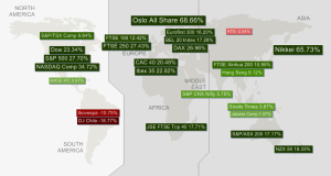
I acknowledge that we  have had a significant upside in equity valuations this year if one takes exception of emerging markets.  Most markets have had  double digit returns  that can t remain unnoticed to the average investor . So despite my bullish view emulated in the above this  raises some issues about the market being possibly overbought.

untitled

The chart below investigates the periods were the S&P500 has had a statistically similar run and plots what has happened in the following 250 days ( I use a sample of daily data spanning from 1980 to date).   Clearly what we have seen  is pretty much average in regard of past bull markets  and from there the possibilities are broad we could retrace by close to 30% or rally by another 50%, if history is a guide at all.

S&P500

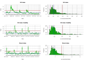
Meanwhile the VIX  which should embed market expectations  about possible risks remains well below its long term median. My other metrics of market risk Volga and Shockindex are similarly close to their historical low. This may indicate a level of vunerability of the market but also reflects that the flows going into equities are somehow dampening the market volatility.

risk metrics 
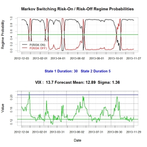
Finally my two-state Markov regime switching model still indicates  that we are within a risk on environement (i.e long equity risk) and there are no sign of  a change there.

markov

So  I guess I ll stick to my bullish view and will keep my broker unhappy by holding my positions…. no commissions for him in December….


Go Long Equities

As a follow up of all my posts on shift allocation, I thought the below link was of interest even though centric to the UK…

http://www.citywire.co.uk/money/welcome-to-the-stocks-and-shares-isa-club/a718079?ref=citywire-money-latest-news-list

What we are going through is structural ! Even if Yellen and the ECB are dovish ultimately rates will have to go up as the economy carry on to pick up. This will make bonds a disastrous investment relative to equities…..