Category Archives: Market Risk

Long Equities as Usual

As market risk has been trading on the low over the last few months I thought that I would post a few charts of mine. First looking at the VIX as a measure of  financial market risk we are indeed trading at relatively low level, though we are still a few points away from the  9.31 the lowest ever close that printed on the 22nd of December 1993 .  The  two states Markov regime switching remains  clearly on risk seeking mode.

vixregime

Contributing to this low volatility has been the massive inflows that we have seen on equity markets.  However I would not call this level abnormal, the chart above  start from January 1990 and show that we have indeed experience long period of low volatility in the past. The chart below shows the significance of  inflows/outflows in US mutual funds tracked by the ICI . The chart on the left shows the T-stat of the inflows for the main asset classes over various time horizons. It is clear that the preference has been for  equities, and this with good reasons as discussed in my previous posts. So far in the US alone we have seen close to USD 120 billions of new inflows in US mutual funds.

flowmap05062014 inflow dist

Out of this, as shown by the right hand chart,  close to 40% went into Foreign equities , only 5% into US equities and   21% in hybrids. if we assume a 60/40 benchmark this means an extra 8% into equities. Therefore  potentially 53% of the 120bn invested went into equities.  This is somehow in decline in respect of what we have seen in the first half of 2013 where 162bn went into US mutual funds, with an estimated 62%allocated to equities.  However this is without any doubt a contributing factor to the low level observed in the VIX. Clearly central banks monetary policy  and also the implication for the bond market of an exit scenario on the back of better economic fundamentals has somehow  been behind the great rotation that started now a couple of years ago. The last chart showing the cumulative inflows in the main asset classes indicates that  there is still some way to go….I ll stick to equities as usual….

cumulative


FX: The End of the World as we knew It ?

I recently went to Imperial College to give a lecture  on currency management issues and decided to  post a  quick summary of it here. If you want more detailed information , feel free to contact me. The first chart shows the evolution of the FX turnover as reported by the BIS in its triennial FX survey. Clearly we have seen a significant increase in FX volume being transacted. From a paltry estimated daily  turnover of 650 billions  market participants are now dealing close to 5 trillions dollar a day.Picture1

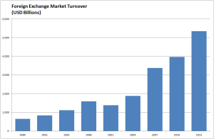
The rise in the percentage of foreign assets  held in both institutional and private portfolios has been supported by both by the increase in the degree of openness of major world economies and the quest for greater portfolio diversification .  Therefore currencies have been called to play a greater role as they became the necessary conduct to foreign assets. Subsequently  active managers  have developed their currency forecasting skills and incorporated directional forecasts in their  asset allocation decisions. This somehow brought a new breed of managers that focussed solely on currencies, be it for speculative (currency as an asset class) or hedging reasons (currency overlay). Indeed a more specialised knowledge is  arguably required  due to the specificity of currency markets. The success  and growth in numbers of those managers is well illustrated by the below charts that shows the rolling  3-year risk adjusted return of the median currency managers and the number of currency programs tracked by the investment consultant Mercer.

Picture12Picture11

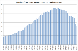
Despite a promising start  both in absolute and relative terms it is fair to say that the typical currency manager performance has somehow degraded over the last decade. The number of pure currency  programs has been significantly reduced since 2008. Recently we have seen the closure of funds managed by FX concepts, QFS and Brevan Howard amongst other casualties.  The recent history of risk and the particular chain of events that took place following the onset of the Sub-Prime Mortgage crisis has a strong explanatory power  to this  as it triggered the change of market regime  which affected negatively the performance of many active managers out there be them currency or else. The following chart shows the ratio between the volatility of the VIX and its nominal level over a rolling period of 21 days, which historically has been a good classifier of risk events. Clearly risk spikes have been more frequent and it may well be that active managers as a whole found it more difficult to operate within this new regime. Maybe some strategies were too “naive” or clearly lacking in portfolio construction and robust risk management.

Picture10

Possible explanation to lesser returns  may lie in central banks driving their monetary policy in unchartered territory  in an attempt to deal with the financial crisis. This resulted in short term interest rates reaching absurdly low levels globally. This somehow eroded the incentive  the carry strategy which had been a significant source of returns for currency managers.

Picture4Picture3

Looking at a large sample of data  spanning from the early 70′ to date it is noticeable that  the short term carry that can be obtained through buying currencies with a high level of interest and selling the ones with low nominal interest rate has steadily decreased from what used to be to currently reach an all time low.  The above charts show that the median level of carry spread for G10 crosses  (1-month nominal rate differentials) has decreased from 4.10% to 2.32% whilst the average level of delivered volatility for the 45 exchange rates in focus has increased from a median 10.63% over the first period to 11.44 % for the second period. In other word the average delivered risk return of G10 carry strategies has nearly halved from   0.39 to 0.21 prior albeit modest transaction costs. At current level of carry of close to 1% the risk return of carry stands at close to 0.1 which is clearly not very attractive from an investor standpoint of view. However damaging the reduction in spreads and change in market risk regimes  may have been to the performance of managers it is fair to argue that those may be just transitory  in nature  and that better days will come for currency managers when central banks will step back from their extraordinary measures.

More concerning to investors  may be some structural issues that have remained unnoticed  or ignored by many managers. The last 25 years has been dominated by significant progresses in telecommunication and computing technology. Those innovations have had  without any doubts a massive impact on how market practitioners transact in the markets. Technology developments clearly affected trader’s ability to access the market in terms of speed , efficiency and information gathering. It is symptomatic indeed that over the last couple of decades voice broking virtually disappeared whilst electronic trading platforms came to dominate the trading landscape. I surmise that a significantly enhanced transparency, price discovery and  sharply increased  speed of transaction may have put us a step closer to a strong form of market efficiency  as described by Fama (1970).

Picture5        Picture6

Currency can be classified under different regimes (trending, mean reverting or random) by using the autocorrelation and drift significance of the underlying time price series. The below figure shows the aggregated  level of membership to each regime and its local polynomial regression fit for the 45 G10 crosses since 1971. We used a rolling window of 125 days to do conduct the analysis ( contact me if you want to know about the methodology I used).

Picture2

The most dominant feature is the significant increase in exchange rate randomness which correlates with the decrease in performance of currency managers observed over the last decade. Clearly some managers have fared better than other due to their exposure to less liquid emerging market currencies therefore reaping higher return because of larger interest rate spreads, however as was seen during various crisis and in early 2014 this would have been by taking on board greater risk premium and therefore being of a disputable service to investors.

World globalisation and the growth in technological and transactional technology over the last few decades has reshaped the investor opportunity set as Lebaron (1999) partly concluded in his own research it also explains the disappearance of some inefficiencies.  The KOF Swiss Economic Institute , one of the leading economic “think tanks” in Switzerland  compiles the Index of Globalization. The index measures three main dimensions of globalization, namely: economic, social and political. There are also sub-indices referring to actual economic flows , economic restrictions , data on information flows , data on personal contact  and data on cultural proximity.  The data is available on a yearly basis for 207 countries. It is currently available for the period 1970 – 2010 . Clearly the KOF  Index of globalisation provides a tangible evidence of how much more integrated the world has become over the period 1970 to 2010 as shown in  the below figures. The darker the shade the more “globalised” a country is, clearly the world in 2010 has become a darker shade of grey and therefore is more “integrated” or “globalised”.

Picture7

Over the last 40 odd years huge technological progresses have been made. Communication and computing technology has equipped us with the ability to capture and analyse a  broader set of information at a near real time frequency. It is now possible to transfer assets across borders at the flick of a button and therefore to settle transaction over very short term periods. The  transactional technology and a greater openness of countries economies  has allowed for investor to have a faster response time to the information set at hand. The following shows  the  average index of globalization for 175 countries  as well as the sub-indices for actual economic flows (as a broad measure of economic openness) and data on information flows (as a measure of communication technology progress).

IPicture8

It  is apparent  from  the above that the trend in the level of randomness of currencies  has significantly increased  over the last 40 odd years and that this trend correlates positively to the globalisation trend, greater openness of world economies and development in communication technology. The predictability of currencies over that period has lessened  as would be consistent with higher information arrival and availability. Clearly the cheaper cost of  microchips and software  has brought us a step closer to the strong form of market efficiency.  Single style / naive currency strategies are therefore less likely to be of interest to investors as the premises they are based upon  have been seriously impaired by those developments. It is therefore likely that most systematic or discretionary investment processes relying on past tenets might encounter significant headwinds as we have seen. However the variability in exchange rate membership  to the random/trending and mean reverting  regime that I have observed in my research may offer some opportunities  to managers who invest time and resources  on regime detection technology. It is therefore my  belief that investors should give greater consideration to multifactor regime switching frameworks be them systematic or fundamentals  in order to derive significant returns from FX markets.


Not Quite the Berezina…

Ok I may have been a bit facetious in my last blog in regard of  my view on the impact of Russia and China on the Financial markets. This clearly has come back to haunt me, at least this is what I am being told by the mark to market of my stock portfolio.  Despite the ensuing underperformance of global stock markets it is quite interesting to note how resilient the “Index of Fear”, namely the VIX. The change in market volatility has been quite tame so far.  Maybe this gauge of fear is not what it used to be….It may well be also that the market was somehow over insured  against risk. Anyhow my point is that what we are seeing now  is  not a capitulation or dislocation but rather an orderly adjustment of market portfolio risk by investors.

indexmap  risk

After this more volatile few weeks I though I would look at my favourite data, namely the US mutual funds flow data released by the ICI. Surely the Ukrainian story should have had some implications on investors perception of stock markets and this should be reflected in their investment flows. From what we can see from the below charts, this has had little to no effect so far. Investors are still buying equity “en masse”, with a preference for international equities. This as I said in past blogs may be one of the factors keeping the lid on a dollar rally as those flows tend to be un-hedged by nature.

cumulative flows flowmap

The only notable difference is the renewed interest in bond products that took place since the investiture of Yellen at the helm of the Fed. Clearly her dovish tone has helped in that respect. However with better numbers across the board coming out from the US, I am not so sure this will be a lasting proposition….I still stick to my view that the global economy is thriving  and that equities should therefore be the favourite asset class for the next cycle, and I will therefore bear with the geopolitical noise an pains a  bit longer.


Forget about Putin and China !

Ok it It has now been a month since my last posting since I was busy doing some academic work  on the side. Anyhow what an interesting time we have had since the 12th of February…Putin venturing into Crimea, China releasing weak numbers, copper  collapsing etc….Anyhow it seems that the markets have taken cue to this and that equity markets have retraced. The index map charts  below shows the level of significance (T-stats) of the moves observed for major stock indices over various time period. It has been tough over the last week and the main driver was probably the referendum in Crimea due the 16th of March…..

Rplot01

Interestingly enough despite those retracements the  VIX has barely moved and my 2 states Markov regime switching model remains entrenched in a more rosy picture of the world.

riskvixmarkov

So it is time again to see what inflows/outflows we have had in US mutual funds by looking at the Investment Company Institute data and here below are the usual chart showing the significance of those flows over various time horizon as well as the cumul since 2008. Not much change in what has been seen over the last two years….Buy global equities and sell bonds…

Rplot01 cumulflow

Over the last month close to USD 50bn went into equities whilst  USD 19bn came out of Bond products. I ll stay with the crowd…R.I.P PIMCO…..

A Storm In a Tea Cup !

Ok it has been a couple of eventful weeks if you were invested in equities be them from developed markets or emerging markets. Clearly the scaremongering of analysts and journalists paid by the line rather than the true profit they generate has somehow fed into the volatility and sudden lack of rationale of markets. We have seen a spike in the VIX and  as indicated by a 2-state Markov regime switching model a risk off scenario. As mentioned in my previous post, it is worth bearing in mind that those periods of risk aversion tend to be short and somehow provide good ground for opportunities.vixregimes

True  the sell off  somehow pushed most equity markets in the red. But if one take time to look at the moves that unfolded they have not been really out of tune from what could be expected from the median risk of equity markets. By that I mean that if you assume that equity markets have  typically an annualised volatility of 20% this means that the monthly move expected  under a normal distribution assumption should be tantamount to 20% * 1.6450 /sqrt(12) = +/- 9% . So true enough some of the markets such as Japan and Chile have gone  somehow out of this range as shown in the below chart. But I would argue that we are not miles away and that there is no reason to panic because  a herd of unknown analysts have come out from the woodworks forecasting the end of the world as we know it…..a loss of nerves is is to be expected every time we have a down move of more than 5%.

untitled

In respect of the S&P500  the move we have seen over the last 21 days is indeed pretty much middle of the road as a close neighbour analysis using daily data back to 1980 demonstrates. From there the scenarios are quite varied…

pattern

So let’s go back to the catalyst of those financial ripples, the Fed policy an its impact on global liquidity. Well , there is nothing new about the Fed reducing its liquidity supply. We have been told last year what was the plan and you are better getting use to it ! Bottom line is that things are going very well in the US, the data is clearly indicating a strong recovery which is logically feeding into both the housing markets and the equity markets. So it may well be that the liquidity which is smoothly withdrawn  by the fed will in fact be replaced by investment flows and a growing trading activity between the developed world and emerging market countries as those economies recover and re-leverage. Perversely this could have a negative effect on the dollar as it will mean more cross border flow toward new international opportunities by US investors and corporates. Also as  growth come back and US withdraw some of its liquidity it is likely that some of the EM countries will draw on there reserves  which is predominantly made of US$ to stimulate their own economies. Anyhow it is worth looking at the latest batch of data on inflow in US Mutual funds as it now cover the recent period of volatility.

inflowversus VIXflowmap

And guess what…. investors are still buying international and domestic equities significantly. Bonds flows have somehow recovered ever so slightly….though my view is that they will probably shift back to negative for the reasons presented in my previous posts…..So I think I ll keep re-investing those dividends in financial equities for a while..

When the Tough Gets Going……

Ok everything was going well and then suddenly the market decided to remind itself that the Fed was in tapering mode and that this should feed into EM liquidity.  Bearing in mind what the Fed told us about the tapering early December and that overall US  data has been on the good side, I am not so sure this FOMC release should have been a surprise to anyone. Anyway it has been a bit of a bloodbath over the last week  in preparation of the release as can be seen from the below charts. The first one shows the T-Stats (i.e mean return/standard deviation * sqrt(sample size -1)) over various time horizons for major equity markets whereas the second one shows the components of the FTSE 100, my current playground. The greener the best and the redder the closer to hell for the bulls…

stock markets      ftse100all

So what is the driving  reason to sell equities and “risky assets”  aside generating fees and commissions for some ? Clearly the market does not seem to be  at its most rational state. The Fed tapering as mentioned in my other posts should be good news since it is driven by the bettering of the US economy. Even things seems to get better in some part of Europe. Ok China is slowing down  as per its latest data points but this is engineered  and certainly not an abrupt surprise. Anyhow the Chinese government has ample reserves to steer their economy up if they wanted and Japan is really picking up at long last.  Looking at my favourite data which track US mutual funds inflow/outflows it looks like recent events have not slow down the appetite of US investors for international equities. In fact we carry on pretty much on the same established trends of last year. Buy equities and stay away from bonds….and the bond inventory is humongous which does not bode to well in a cycle were rate3s are likely to go up at one stage…R.I.P PIMCO and alike….

usmutualfunds cumulative flows

So what to do when its getting tough ? Clearly the world is not any different than what it was in the last quarter of 2013…The global economy is slowly but surely re-leveraging and the central bank will remain accommodative potentially leading us to an inflation surprise down the road. Though we admittedly have some time before we get there as we clearly need the consumers to reach his wallet in a more significant fashion. The risk environment is in safety mode as shown by a Markov 2-state regime switching model. And yes the VIX the so called index of fear as spiked….

regimes    vix

However as a quick observation , historically those period of   loss of nerves by market participants  are not very long lasting and tend to open new opportunities. Now the Fed has released  its statement it is time to buy back those stocks….hopefully at a lower cost after fees….Else just hang on to your longs….

Mark My Words: It Is Just The Beginning Of The Bloodbath For Bonds !

Quite clearly the last Fed meeting of the year was  important. We got the long awaited  announcement that the purchase of Treasuries and MBS would be reduced. The rate of 10 billions  a month at which it decided to decrease its security purchase was mild enough to demonstrate that the Fed meant to remain accommodative and that its main concerns were the relatively high unemployment rate and the stubbornly low inflation rate, as shown in the word cloud of the Fed Statement. fed cloud 18122013

To put in context  how mild this reduction of security purchase by the Fed is, it is worth bearing in mind that US mutual fund holders have been redeeming from bond funds at an average rate of 23 billions a month over the last seven months. This probably supports my contention that the Fed will accept to lag the market shift in asset allocation so as not to send those long term rate flying… but ultimately the 10 year US rate is more likely to trade close to 4% than 2% within the next year or so as private sector redemptions and government withdrawal of liquidity  will ineluctably  bear on bond valuations. So we will see further steepening in yield curves. The reason behind the price dynamic is clearly driven by growth expectations which are rationalised by the continuous decrease we have observed in US unemployment and general pick up in economic activity.  Anyhow it seems that the market took the news very well  since we have seen a small upside in equity markets and the VIX  has been holding at what once would have been deemed insanely low levels as shown in the below chart.

vix20122013

As of why the VIX remain so low,  my theory is that the dynamic is supported by the significant inflows we are seeing in the equity markets. selling short the VIX should indeed correlate with a long position in equity markets.  Anyhow  the last batch of data has just been released by the ICI and guess what ? It is redemption time again for those fixed income funds. Somehow the Fed meeting which acted as a beacon for the Roubinni’s of this world and black swan watchers proved to be a damp squib because of the modest decrease in security purchase announced. Not surprisingly there were a few outflows for domestic equity funds ahead of the Fed release and the outflows in bonds was as usual negative (as would be consistent with a decrease purchase by the Fed). It is worthwhile noting however that the flows toward global equity funds remained significantly positive. This  ultimately lead me to thing that this will put pressure on the US$ particularly against the EURO because of the country weighting in MSCI and other equity benchmarks.   Below are the usual map charts and cumulative charts.

flow map 201220133

As mentioned in the above the inflows into equities and outflows from bond products are taking place in a relatively low risk environment (as expressed by the VIX).  I find this interesting as it is consistent with an orderly shift in asset allocation. We are not talking about the kind of asset shift we have seen in 2007/2008. It was then clearly driven by a strong risk adversity and therefore not a long lasting proposition. The chart below illustrates well the new flow dynamic we are experiencing.

inflow outflow vix

This kind of configuration tends to occur when an equity bull markets is taking hold. So my view remain stubbornly unchanged and you are better to get used to the above charts….the bloodbath for bonds has just started it will be slow and agonising…I will stay long equity Beta.

Should I Stay or Should I Go ?

As we are nearing the end of the year and that typically we should see liquidity drying up as well as  rumors about a nasty retracement in equities abounding I thought I would have a quick look at some of my pointers. Clearly it has been a nice run so far and central banks have been very helpful in supporting the current bull market. The latest data from the ICI   demonstrates that there is no stopping American investors buying international equities and selling bonds. And my thought is that the situation is similar in many of the major economies which are on their way to recovery. I guess the risk of a major retracement in the bond markets in the next couple of years is still a significant risk  whilst upside likelihood remains limited so there is a strong rationale for a private investors to go bull on equities as the economy is picking up.  The chart below shows the significance of the inflow and outflow in US Mutual funds by asset classes and over various time horizons. The greener the more inflows the redder the more outflows….Clearly we have been in equity buying mode for a while now.

US MUTUAL FUNDS flowsDespite the significance of the flows observed the dent made to the level of investments  accumulated in bonds over the years  remains modest so far. This is good news for the current rally as therefore there  is still much adjustment to take place all being equal. Clearly  what we will experience ahead will be dependent on future economic growth. Bearing in mind the track record of accuracy of forecasts made by economists and alike my view of a significant economic growth in  the next few years based on the lagged response to the significant stimulus provided by major economies is as good as any. Over a shorter horizon  I think it is fair to say that so far governments and financial authorities have done a relatively good job and that the green shoots of recovery are well established. My view is that  central banks will be weary of adjusting their monetary policy  too fast as they will want to maximise the likelihood of  strong economic recovery and job creation. Inflation will definitively become acceptable if accompanied by strong growth. A scenario of higher nominal rates but not necessarily higher real rates should further promote  flows toward equities. Lets face it what we are seeing is structural and we probably have another few years of equity beta coming our way.

cumulative flows us mutual funds

I acknowledge that we  have had a significant upside in equity valuations this year if one takes exception of emerging markets.  Most markets have had  double digit returns  that can t remain unnoticed to the average investor . So despite my bullish view emulated in the above this  raises some issues about the market being possibly overbought.

untitled

The chart below investigates the periods were the S&P500 has had a statistically similar run and plots what has happened in the following 250 days ( I use a sample of daily data spanning from 1980 to date).   Clearly what we have seen  is pretty much average in regard of past bull markets  and from there the possibilities are broad we could retrace by close to 30% or rally by another 50%, if history is a guide at all.

S&P500

Meanwhile the VIX  which should embed market expectations  about possible risks remains well below its long term median. My other metrics of market risk Volga and Shockindex are similarly close to their historical low. This may indicate a level of vunerability of the market but also reflects that the flows going into equities are somehow dampening the market volatility.

risk metrics Finally my two-state Markov regime switching model still indicates  that we are within a risk on environement (i.e long equity risk) and there are no sign of  a change there.

markov

So  I guess I ll stick to my bullish view and will keep my broker unhappy by holding my positions…. no commissions for him in December….


Buy Global Equities…Sell Bonds !!!

My favourite data is out again and since  it has been a long time that I have not published my fancy charts and that we are at the 11th hour of debating the debt ceiling in the US this could be quite topical. Agree or disagree about what the typical US investors does and its predictive value I think they are right so far. Clearly the pattern of selling bonds is an on-going theme and favouring foreign equities against domestic one is now an established trend for US investors as can be seen from the charts below. The one on the right shows how significant has been the inflow/outflow in each of the asset classes across different time periods whereas the one on the left shows the inflow / out flow in US mutual funds so far this month.

ici flowsflow map 102013

So  what now ? I guess if we get some kind of  resolution it will  be good short term for those treasuries as it will support the US credit rating (what does Fitch know about it anyway ?….) . Clearly it should be good for risk appetite so I still think long  international equities is a good bet and get ready to sell some dollar after the next couple of days of exuberance …else I guess it is the idiocy that Buffet refers to…god save us all….nowhere to hide this time….

S&P500 Where Now ?

Not that I am a great believer in using past market patterns to forecast the future, I however think that it may be helpful to put things in perspective bearing in mind the current debate on the US debt ceiling and the possible outcome of tonight’s vote. So I have used an R script posted on the “Systematic Investor” to look at what the S&P has done over period of 125 days and  to compare it to period  in the past where it exhibited the same type of behaviour whilst posting also the following 125 days…..

patternssp500102013

Looks pretty much middle of the range to me, so there is plenty of room left to express yourself as a bear or a bull….I am of the later… 🙂