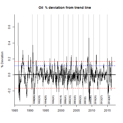
Whatever the market being traded, there always will be a a question being asked at one moment: How far can this thing go ? Clearly not an easy question to answer as this will invariably depends on factors that are partly unknown or difficult to estimate, such as fundamentals, market positioning or market risk amongst others. The first part is obviously to assess how atypical the move experienced in the given instrument is. This report aims to contribute to this.
The below chart shows the WTI Spot Price over the period of January 1986 to April 2016 . On the 28 April 2016 it was trading around 45.96.

In the below I plot the previous 125 days against other similar historical periods that would have closely matched the recent history. The data has been normalised so as to be on the same scale. The chart shows the latest 125 days in black, and overlay similar historical patterns in grey. It Also shows what has been the price path for the following 125 days as well as the observed quartiles.

Finally I plot the last 125 days and a trend forecast derived from an ARIMA(1,1,0) model as well as the 95% confidence intervals. The ARIMA model is fitted to the past 625 historical values whilst ignoring the last 125 days, therefore we can look at the recent price path against the trend forecast and its confidence intervals to gauge how (a)typical the recent move has been.