Category Archives: Asset allocation

UK Investor Allocation Update

The below is a generic asset allocation report produced from the perspective of a UK investor. I use the Barclay UK Gilts all maturities index, the MSCI World ex UK and the MSCI UK Gross indices (i.e dividends re-invested) as proxies for bonds and equities holdings. As time goes I will add a few more asset buckets such as EM, commodities and properties. So see this as a first attempt to an evolutive product.

The below charts shows the rolling 36-month return, volatility and risk adjusted return for each of the assets used in the final portfolio. Clearly equities have a higher volatility than bonds but also higher/lower localised returns highliting that timing is key in unlocking those higher returns.

plot of chunk Summary charts
The below summary performance statistics show that a UK investor would have got the best risk adjusted return by holding a broad basket of Gilts. Over the long term the returns would have been quite similar accross asset classes. However the risk as expressed by the annualised volatility of the monthly returns and the maximum drawdown would have been at it highest for equities and particularly for World Ex. UK stocks.

##                                 Gilts World Ex UK Stocks UK Stocks
## Annualized Return                8.85              10.62     10.43
## Annualized Standard Deviation    6.55              16.00     15.96
## Annualized Sharpe Ratio (Rf=0%)  1.35               0.66      0.65
## Worst Drawdown                  11.42              52.51     44.04

In the following I use a mean-variance model to compute the weights of the portfolio that maximises the information ratio on the efficient frontier.The model is optimised for “long only” and weights adding to one constraints. I use a rolling window of 36-month to estimate the returns, volatility and correlation input fed into the Markovitz model. The use of a rolling window implies that the momentum effect in the input is captured by the optimisation. Therefore if an asset becomes more attractive through time in terms of its risk adjusted return and/or diversification potential its participation into the final portfolio should increase and vice versae.

The two charts below show how the optimised portfolio weights have changed throughout time and also what were the weights at the end of the last month.

plot of chunk weights_chart
Using the above weights I then calculate the return of the portfolio for the folowing period assuming a cost of 0.25% of adjusted notional for each monthly rebalancement. The performance is compared to the return of a portfolio composed of 60% Gilts and 40% UK equities.

plot of chunk Opt_porfolio_charts

**Summary Performance Statistics **

##                                 Benchmark 60/40 Optimal Portfolio
## Annualized Return                          8.58              8.13
## Annualized Standard Deviation              7.86              5.90
## Annualized Sharpe Ratio (Rf=0%)            1.09              1.38
## Worst Drawdown                            13.54             11.26

Drawdowns Table

##         From     Trough         To  Depth Length To Trough Recovery
## 1 1994-01-31 1994-05-31 1995-05-31 -11.26        17     17        5
## 2 1990-01-31 1990-04-30 1990-11-30  -9.49        11     11        4
## 3 1986-09-30 1986-09-30 1987-01-31  -6.06         5      5        1
## 4 2009-01-31 2009-01-31 2009-08-31   -5.1         8      8        1
## 5 2008-01-31 2008-06-30 2008-12-31  -5.07        12     12        6

Monthly Returns

##       Jan  Feb  Mar  Apr  May  Jun  Jul  Aug  Sep  Oct  Nov  Dec YEARLY
## 1984  1.6 -1.9  4.1  0.2 -4.4  1.7 -1.6  7.0  2.9  2.1  2.1  0.9   14.6
## 1985  1.6  1.8 -1.1  0.7  1.4  0.2  1.1  1.8  1.2  1.0  0.8  0.8   11.3
## 1986 -0.1  5.0  7.2  1.9 -0.2 -0.5  0.2  2.4 -6.1  1.0  0.0  3.1   13.9
## 1987  3.6  2.9  3.2  2.2  1.3 -1.0 -1.1 -0.5  0.6 -2.3 -0.4 -0.3    8.1
## 1988  2.9  2.0  1.0 -0.1  0.4  0.3  1.0 -1.7  2.7  1.8 -1.8  1.5   10.0
## 1989  3.2 -0.3  0.8  0.8  0.0  0.8  3.5  0.6 -1.3  0.8  0.1  1.9   11.1
## 1990 -3.5 -2.1 -2.5 -1.7  5.8  2.0 -0.3 -1.3 -0.8  3.9  3.0  0.3    2.8
## 1991  3.7  1.9  1.2  0.4  0.3  0.3  2.3  1.9  2.4  0.4 -0.4  1.3   15.8
## 1992  2.5  1.3 -2.4  4.1  2.1 -0.4 -0.2 -1.0  4.0  5.2 -1.0  2.5   16.6
## 1993  1.3  2.2  0.8 -1.3  0.5  3.3  2.4  3.4  0.1  1.3  1.9  3.6   19.8
## 1994 -0.1 -3.6 -3.3 -1.1 -3.7  0.5  1.4  0.9 -1.2  1.0  2.1 -0.5   -7.4
## 1995  1.1  0.5  1.4  1.3  3.6 -2.2  2.3  1.4  0.4  1.2  3.7  1.3   15.9
## 1996  0.9 -1.9  0.2  1.9 -0.5  1.6 -0.1  0.7  2.1  0.0  2.3 -0.9    6.3
## 1997  2.3  1.1 -1.7  1.9  2.2  1.0  1.6  0.0  3.8  0.2  0.6  1.8   14.8
## 1998  1.9  0.2  1.7  0.9  1.2 -0.3  0.9  3.1  3.2  0.0  3.1  2.2   18.1
## 1999  1.1 -1.7  0.8  0.1 -1.6 -0.1 -1.0  1.2 -2.2  2.1  1.6 -0.5   -0.2
## 2000 -1.7  1.7  1.4  0.9  0.5  0.4  0.0  0.0  0.4  1.0  1.8  0.6    7.2
## 2001  0.5 -0.4 -0.3 -0.9 -0.6 -0.4  1.9  1.1 -0.9  3.3 -0.2 -2.0    1.0
## 2002  1.2 -0.4 -1.5  0.7 -0.1  1.2  0.2  2.2  0.3  0.1 -0.1  1.0    4.7
## 2003  0.3  1.0 -0.6  1.2  2.4 -0.5 -1.1  0.4  0.4 -1.4  0.4  2.4    4.7
## 2004 -0.4  1.0  0.5 -0.7 -0.9  1.1  0.1  1.6  1.1  1.0  1.3  0.8    6.6
## 2005  0.1 -0.1  0.3  0.9  2.3  1.6  0.0  1.1  0.3 -0.4  1.8  1.6    9.6
## 2006  0.9  0.3 -0.6 -1.2 -0.7  0.0  1.3  0.9  0.6  1.2  0.0 -0.6    2.1
## 2007 -1.3  1.4 -0.2  0.3 -0.3 -1.0  1.2  1.1  0.7  1.6  0.2  1.5    5.1
## 2008 -2.0  0.3  0.2 -0.1 -1.3 -2.2  1.4  2.7 -2.3 -1.1  3.9  5.0    4.4
## 2009 -5.1  0.2  2.7 -0.1 -0.3  0.4  0.3  4.2  0.7 -0.4  1.2 -2.0    1.6
## 2010  0.1  0.1  1.4  0.4  1.5  0.8  0.5  4.0  0.2 -1.0 -0.8  0.6    7.7
## 2011 -1.8  1.0  0.2  2.1  1.0 -0.6  2.7  0.5  2.4  2.4  1.7  1.6   13.2
## 2012  0.7 -0.5 -0.6 -0.3  2.8 -0.1  1.9  0.1 -0.3 -0.6  1.1 -0.2    4.0
## 2013  0.5  2.0  1.9  1.0 -1.1 -2.6  2.2 -2.1  0.7  1.8 -0.7 -0.6    2.9
## 2014  0.6  1.0  0.2  0.4  1.4 -0.5  0.7  3.5 -0.9  1.3  3.3  0.8   11.8
## 2015  4.0 -2.1  1.6 -1.1  0.6 -3.5  1.9 -1.6  0.2  0.5  0.9   NA    1.5

If you need more information or have questions about the above, feel free to contact me at pollux@argonautae.com

US Investor Allocation Update

The following is a generic asset allocation report from the perspective of a US investor. I use the Barclay US all treasury index, the MSCI World ex US and the MSCI US Gross indices (i.e dividends re-invested) as proxies for bonds and equities holdings. As time goes I will add a few more asset buckets such as EM, commodities and properties. So see this as a first attempt to an evolutive product.

The below charts shows the rolling 36-month return, volatility and risk adjusted return for each of the assets used in the final portfolio. Clearly equities have a higher volatility than bonds but also higher/lower localised returns highliting that timing is key in unlocking those higher returns.

plot of chunk Summary charts
The below summary performance statistics show that a US investor would have got the best risk adjusted return by holding a broad basket of US treasuries. Over the long term the returns would have been quite similar accross asset classes. However the risk as expressed by the annualised volatility of the monthly returns and the maximum drawdown would have been at it highest for equities and particularly for World Ex. US stocks.

##                                 US Treasuries World Ex US Stocks US Stocks
## Annualized Return                        4.61               4.26      4.86
## Annualized Standard Deviation            4.55              17.37     15.31
## Annualized Sharpe Ratio (Rf=0%)          1.01               0.24      0.32
## Worst Drawdown                           5.01              59.39     52.92

In the following I use a mean-variance model to compute the weights of the portfolio that maximises the information ratio on the efficient frontier.The model is optimised for “long only” and weights adding to one constraints. I use a rolling window of 36-month to estimate the returns, volatility and correlation input fed into the Markovitz model. The use of a rolling window implies that the momentum effect in the input is captured by the optimisation. Therefore if an asset becomes more attractive through time in terms of its risk adjusted return and/or diversification potential its participation into the final portfolio should increase and vice versae.

The two charts below show how the optimised portfolio weights have changed throughout time and also what were the weights at the end of the last month.

plot of chunk weights_chart
Using the above weights I then calculate the return of the portfolio for the folowing period assuming costs of 0.25% of adjusted notional for each monthly rebalancement. The performance is compared to the return of a portfolio composed of 60% US treasuries and 40% US equities.

plot of chunk Opt_porfolio_charts

**Summary Performance Statistics **

##                                 Benchmark 60/40 Optimal Portfolio
## Annualized Return                          5.18              5.74
## Annualized Standard Deviation              5.69              4.95
## Annualized Sharpe Ratio (Rf=0%)            0.91              1.16
## Worst Drawdown                            19.43              7.29

Drawdowns Table

##         From     Trough         To Depth Length To Trough Recovery
## 1 2007-12-31 2008-10-31 2008-12-31 -7.29        13     13       11
## 2 2009-01-31 2009-06-30 2010-06-30 -4.74        18     18        6
## 3 2003-06-30 2003-07-31 2004-02-29 -4.59         9      9        2
## 4 2015-08-31 2015-09-30       <NA> -4.57         5      5        2
## 5 2004-04-30 2004-05-31 2004-09-30 -3.31         6      6        2

Monthly Returns

##       Jan  Feb  Mar  Apr  May  Jun  Jul  Aug  Sep  Oct  Nov  Dec YEARLY
## 2002  0.5  0.9 -2.2  2.1  0.6  1.1  2.2  2.1  2.4 -0.9 -0.8  2.2   10.1
## 2003 -0.3  1.6 -0.4  0.5  3.0 -0.5 -4.1  0.5  3.0 -1.2  0.1  1.3    3.4
## 2004  0.9  1.2  0.6 -3.1 -0.3  0.7  0.2  1.8  0.7  1.5  0.7  1.8    6.8
## 2005  0.1  0.5 -0.9  0.7  1.0  0.9 -0.4  2.0  0.7 -2.2  1.7  2.9    7.1
## 2006  3.9 -0.2  2.2  3.6 -3.0  0.0  0.9  2.1  0.4  2.1  1.9  0.7   14.6
## 2007  0.2  1.2  1.2  2.4  0.2  0.0  0.6  0.5  2.2  1.9  0.6 -0.5   10.4
## 2008 -0.9  1.1  0.2 -0.1 -0.4 -1.8 -0.5  0.3 -2.4 -2.4  5.0  3.5    1.6
## 2009 -3.2 -0.6  2.2 -1.9 -1.1 -0.2  0.4  0.9  0.8 -0.1  1.4 -2.7   -4.0
## 2010  1.6  0.4 -0.9  1.1  1.7  1.9  0.7  2.0  0.0 -0.2 -0.7 -1.8    5.8
## 2011  0.0  0.1 -0.1  1.3  1.4 -0.4  1.6  2.2  1.2 -0.1  0.5  1.0    8.6
## 2012  1.2  0.2 -0.1  1.0  0.1  0.4  1.1  0.3  0.2 -0.5  0.6 -0.3    4.3
## 2013  0.2  0.7  0.8  1.2 -1.3 -1.3  1.1 -1.1  1.4  1.6  0.4 -0.1    3.7
## 2014  0.3  1.3 -0.1  0.6  1.4  0.4 -0.5  1.9 -1.0  1.6  1.6  0.0    7.7
## 2015  0.3  1.0 -0.2 -0.1  0.3 -1.5  1.5 -3.6 -1.0  3.2 -0.1   NA   -0.2

If you need more information or have questions about the above, feel free to contact me at pollux@argonautae.com

UK Assets Only Investor Dynamic ETF Allocation Portfolio Update

The following report provides analyticals in respect of an investible ETF multi-asset dynamic portfolio for UK assets only investors (I am clearly not saying nor advising that you should invest in such porfolio, I am just producing this for general information). For my allocation exercise I used Ishares ETF. My choice for the Ishares was purely driven by the fact that they have the longest price history. However, bearing in mind that Ishare Equity ETF have a total expense ratio of 0.40% , I therefore would rather use Vanguard or State street ETFs when available for implementation as they have a far much more reasonable TER (close to 10 bps). So my choice of IShares ETF probably affects negatively the numbers shown in the below.

I used the FTSE 100 , FTSE 250, FTSE high Div. ,UK Property , Corporate Bonds, Inflation Linked bonds and Gilts ETFs as my investible universe. The description of each ETF can be accessed by clicking on the assets and following the web link.

The below charts shows the rolling 36-month return, volatility and risk-adjusted return for each of the assets considered. Clearly equities and property have a higher volatility than bonds but also higher/lower localised returns highliting that timing is key in unlocking those higher returns.

plot of chunk Summary charts
The summary performance statistics show that over the period April 2007 to date a UK investor would have had the best risk adjusted return by holding a broad basket of Inflation linked bonds and the worse by investing in the Property index which suffered hugely during the financial crisis.

##                                 FTSE100 FTSE250 FTSE HIGH Div. Property
## Annualized Return                  0.08    4.41          -4.23    -4.86
## Annualized Standard Deviation     14.96   17.92          17.86    23.16
## Annualized Sharpe Ratio (Rf=0%)    0.01    0.25          -0.24    -0.21
## Worst Drawdown                    45.25   53.05          66.41    79.38
##                                 Corporate Bds Inflation Linked Gilts
## Annualized Return                       -0.16             4.73  2.58
## Annualized Standard Deviation            9.87             8.80  6.65
## Annualized Sharpe Ratio (Rf=0%)         -0.02             0.54  0.39
## Worst Drawdown                          32.18            14.86  8.49

Below I show the Markowitz Efficient Frontier based on the past 36-month return series. Each investible asset, the minimum variance and tangent portfolio are shown on the plot as well as the in-sample 36-month annualised returns. The Green line is just the risk free line (I assumed zero risk free).

plot of chunk frontier

I then used a mean-variance model to compute the weights of the portfolio that maximises the risk return ratio on the efficient frontier.The model is optimised for “long only” and weights adding to one constraints. I used a rolling window of 36-month to estimate the returns, volatility and correlation input fed into the Markovitz model. The use of a rolling window implies that the momentum effect in the input is captured by the optimisation. Therefore if an asset becomes more attractive through time in terms of its risk adjusted return and/or diversification potential its participation into the final portfolio should increase and vice versae as time goes. The two charts below show how the optimised portfolio weights have changed throughout time and also what were the weights at the end of the last month.

plot of chunk weights_chartplot of chunk weights_chart
Using the above weights I then calculate the return of the portfolio for the folowing period assuming a transaction cost of 0.15% of adjusted notional for each monthly rebalancement so as to factor in bid-ask spreads. The performance is compared to the return of a portfolio composed of 40% Gilts and 60% UK equities.

plot of chunk Opt_porfolio_charts

**Summary Performance Statistics **

                                 Benchmark 40Eq./60Bds Optimal Portfolio
 Annualized Return                                2.68              4.39
 Annualized Standard Deviation                    5.31              6.16
 Annualized Sharpe Ratio (Rf=0%)                  0.50              0.71
 Worst Drawdown                                   6.02              5.05

Drawdowns Table

      From     Trough      To      Depth   Length To Trough Recovery
 2015-06-29 2015-09-29       <NA> -5.05         7      7        4
 2013-05-30 2013-06-27 2014-02-28 -4.59        10     10        2
 2010-09-29 2011-01-31 2011-09-29 -4.52        13     13        5
 2012-04-29 2012-06-28 2013-02-28 -2.22        11     11        3
 2014-03-30 2014-06-29 2014-08-28 -1.75         6      6        4

Monthly Returns

       Jan  Feb  Mar  Apr  May  Jun  Jul  Aug  Sep  Oct  Nov Dec YEARLY
 2010   NA   NA   NA -0.2  0.4  1.0 -0.9  4.4 -0.1 -2.6 -0.4 0.9    2.3
 2011 -2.3  1.0  0.5  0.5  0.9 -0.6  2.0 -0.8  1.9  0.7  1.5 1.4    6.6
 2012  1.7 -0.1  0.1 -1.9  0.2 -0.5  1.3  0.4 -0.7 -0.8  0.4 0.3    0.5
 2013 -0.3  1.7  2.1  0.1 -1.4 -3.2  3.0 -1.4  1.1  1.1 -0.9 0.1    2.1
 2014  0.7  1.9 -0.6 -1.0  0.7 -0.9  0.2  3.0 -1.7  1.5  4.6 0.4    8.8
 2015  5.4  1.1  0.7 -1.0  2.7 -3.8  2.7 -3.3 -0.5  2.9 -2.2  NA    4.6

If you need more information or have questions about the above, feel free to contact me at Pollux@argonautae.co.uk

US MUTUAL FUND FLOWS REPORT UPDATE 18-02-2015

Wed Feb 18 15:30:28 2015

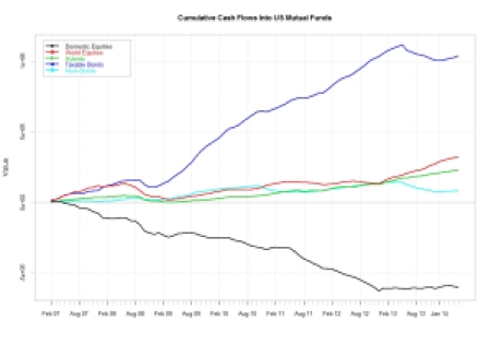
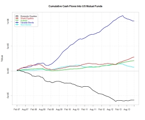
Fund flows are important as they reflect the general investor preference for a specific asset class given current and expected economic conditions and market risk. They may also highlight non-sustainable market positioning. The ICI in the US tracks about 98% of the inflows and outflows in US mutual funds and makes its data freely available on its website. The following is a summarised report of the data it publishes every Wednesday. The first charts shows the cumulative inflows/outflows in each of the asset classes buckets since 2007

plot of chunk cumulative

During the month of February we have seen flows of US$ 3.51Bn in Domestic equities,US$ 2Bn in international equities, US$ 1.75Bn in Hybrid products,US$ 7.44 Bn in taxable bond funds and US$ 1.66Bn in non taxable bond funds.

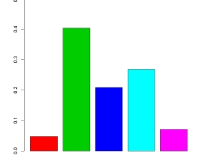
plot of chunk month to date The Charts below shows the distribution in percentage terms of the US$ 63Bn that have flowed into US$ Mutual funds over the last 12-month.

plot of chunk distribution

The below charts show the monthly inflows/outflows for each type of fund and plot them both within their 95% confidence intervals and also relative to their historical distribution. This provides a level of information in respect of how “out of line” or not the current month inflows/outflows may be relative to their past history. In the distribution charts The current month is highlited in blue whereas the vertical red lines represent the 95% confidence intervals.

plot of chunk flowdistribution

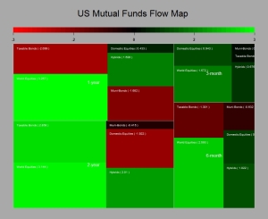
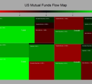
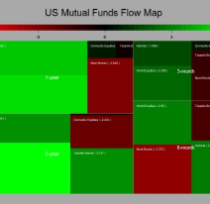
The chart below plot the inflows/outflows T-statistics for each of the funds cathegories considered. The Map chart provides information for period ranging from 2 years to 3 months.The greater the square the more important the inflows (green) outflows(red) over a given period.

plot of chunk flowmap

Long Equities as Usual

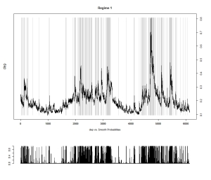
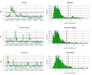
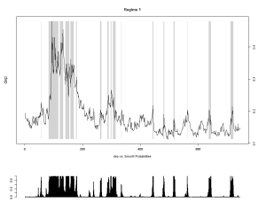
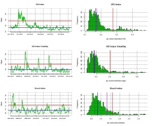
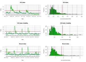
As market risk has been trading on the low over the last few months I thought that I would post a few charts of mine. First looking at the VIX as a measure of  financial market risk we are indeed trading at relatively low level, though we are still a few points away from the  9.31 the lowest ever close that printed on the 22nd of December 1993 .  The  two states Markov regime switching remains  clearly on risk seeking mode.

vixregime

Contributing to this low volatility has been the massive inflows that we have seen on equity markets.  However I would not call this level abnormal, the chart above  start from January 1990 and show that we have indeed experience long period of low volatility in the past. The chart below shows the significance of  inflows/outflows in US mutual funds tracked by the ICI . The chart on the left shows the T-stat of the inflows for the main asset classes over various time horizons. It is clear that the preference has been for  equities, and this with good reasons as discussed in my previous posts. So far in the US alone we have seen close to USD 120 billions of new inflows in US mutual funds.

flowmap05062014 inflow dist

Out of this, as shown by the right hand chart,  close to 40% went into Foreign equities , only 5% into US equities and   21% in hybrids. if we assume a 60/40 benchmark this means an extra 8% into equities. Therefore  potentially 53% of the 120bn invested went into equities.  This is somehow in decline in respect of what we have seen in the first half of 2013 where 162bn went into US mutual funds, with an estimated 62%allocated to equities.  However this is without any doubt a contributing factor to the low level observed in the VIX. Clearly central banks monetary policy  and also the implication for the bond market of an exit scenario on the back of better economic fundamentals has somehow  been behind the great rotation that started now a couple of years ago. The last chart showing the cumulative inflows in the main asset classes indicates that  there is still some way to go….I ll stick to equities as usual….

cumulative


Not Quite the Berezina…

Ok I may have been a bit facetious in my last blog in regard of  my view on the impact of Russia and China on the Financial markets. This clearly has come back to haunt me, at least this is what I am being told by the mark to market of my stock portfolio.  Despite the ensuing underperformance of global stock markets it is quite interesting to note how resilient the “Index of Fear”, namely the VIX. The change in market volatility has been quite tame so far.  Maybe this gauge of fear is not what it used to be….It may well be also that the market was somehow over insured  against risk. Anyhow my point is that what we are seeing now  is  not a capitulation or dislocation but rather an orderly adjustment of market portfolio risk by investors.

indexmap  risk

After this more volatile few weeks I though I would look at my favourite data, namely the US mutual funds flow data released by the ICI. Surely the Ukrainian story should have had some implications on investors perception of stock markets and this should be reflected in their investment flows. From what we can see from the below charts, this has had little to no effect so far. Investors are still buying equity “en masse”, with a preference for international equities. This as I said in past blogs may be one of the factors keeping the lid on a dollar rally as those flows tend to be un-hedged by nature.

cumulative flows flowmap

The only notable difference is the renewed interest in bond products that took place since the investiture of Yellen at the helm of the Fed. Clearly her dovish tone has helped in that respect. However with better numbers across the board coming out from the US, I am not so sure this will be a lasting proposition….I still stick to my view that the global economy is thriving  and that equities should therefore be the favourite asset class for the next cycle, and I will therefore bear with the geopolitical noise an pains a  bit longer.


Forget about Putin and China !

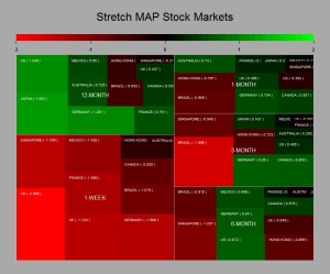
Ok it It has now been a month since my last posting since I was busy doing some academic work  on the side. Anyhow what an interesting time we have had since the 12th of February…Putin venturing into Crimea, China releasing weak numbers, copper  collapsing etc….Anyhow it seems that the markets have taken cue to this and that equity markets have retraced. The index map charts  below shows the level of significance (T-stats) of the moves observed for major stock indices over various time period. It has been tough over the last week and the main driver was probably the referendum in Crimea due the 16th of March…..

Rplot01

Interestingly enough despite those retracements the  VIX has barely moved and my 2 states Markov regime switching model remains entrenched in a more rosy picture of the world.

riskvixmarkov

So it is time again to see what inflows/outflows we have had in US mutual funds by looking at the Investment Company Institute data and here below are the usual chart showing the significance of those flows over various time horizon as well as the cumul since 2008. Not much change in what has been seen over the last two years….Buy global equities and sell bonds…

Rplot01 cumulflow

Over the last month close to USD 50bn went into equities whilst  USD 19bn came out of Bond products. I ll stay with the crowd…R.I.P PIMCO…..

When the Tough Gets Going……

Ok everything was going well and then suddenly the market decided to remind itself that the Fed was in tapering mode and that this should feed into EM liquidity.  Bearing in mind what the Fed told us about the tapering early December and that overall US  data has been on the good side, I am not so sure this FOMC release should have been a surprise to anyone. Anyway it has been a bit of a bloodbath over the last week  in preparation of the release as can be seen from the below charts. The first one shows the T-Stats (i.e mean return/standard deviation * sqrt(sample size -1)) over various time horizons for major equity markets whereas the second one shows the components of the FTSE 100, my current playground. The greener the best and the redder the closer to hell for the bulls…

stock markets      ftse100all

So what is the driving  reason to sell equities and “risky assets”  aside generating fees and commissions for some ? Clearly the market does not seem to be  at its most rational state. The Fed tapering as mentioned in my other posts should be good news since it is driven by the bettering of the US economy. Even things seems to get better in some part of Europe. Ok China is slowing down  as per its latest data points but this is engineered  and certainly not an abrupt surprise. Anyhow the Chinese government has ample reserves to steer their economy up if they wanted and Japan is really picking up at long last.  Looking at my favourite data which track US mutual funds inflow/outflows it looks like recent events have not slow down the appetite of US investors for international equities. In fact we carry on pretty much on the same established trends of last year. Buy equities and stay away from bonds….and the bond inventory is humongous which does not bode to well in a cycle were rate3s are likely to go up at one stage…R.I.P PIMCO and alike….

usmutualfunds cumulative flows

So what to do when its getting tough ? Clearly the world is not any different than what it was in the last quarter of 2013…The global economy is slowly but surely re-leveraging and the central bank will remain accommodative potentially leading us to an inflation surprise down the road. Though we admittedly have some time before we get there as we clearly need the consumers to reach his wallet in a more significant fashion. The risk environment is in safety mode as shown by a Markov 2-state regime switching model. And yes the VIX the so called index of fear as spiked….

regimes    vix

However as a quick observation , historically those period of   loss of nerves by market participants  are not very long lasting and tend to open new opportunities. Now the Fed has released  its statement it is time to buy back those stocks….hopefully at a lower cost after fees….Else just hang on to your longs….

2014 …Same All Same All…But Only Faster…

Ok it looks like 2013 finished on a theme of international equity buying and selling of bonds. Or so tell us the latest  data release of the US jmutual fund flow data from the ICI . The usual charts are in the below.

inflow 31122013

Cumulative flows

flowmap

And yes we still have a lot of stale bond investments to clear out there so on an inventory basis bearing in mind the withdrawal of liquidity that central banks are about to embark on and the effect it will have on bond valuations I will stick to my long view on equities and short bonds. I think the telling factor for 2014 will be the acceleration of the shift in asset allocation ( I ll think of a few charts to visualise this…) ….It may even think about building up further my holdings of financial equities….


Mark My Words: It Is Just The Beginning Of The Bloodbath For Bonds !

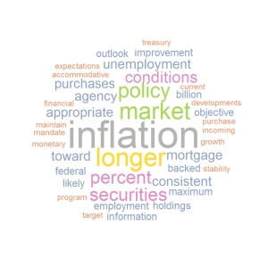
Quite clearly the last Fed meeting of the year was  important. We got the long awaited  announcement that the purchase of Treasuries and MBS would be reduced. The rate of 10 billions  a month at which it decided to decrease its security purchase was mild enough to demonstrate that the Fed meant to remain accommodative and that its main concerns were the relatively high unemployment rate and the stubbornly low inflation rate, as shown in the word cloud of the Fed Statement. fed cloud 18122013

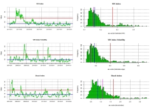
To put in context  how mild this reduction of security purchase by the Fed is, it is worth bearing in mind that US mutual fund holders have been redeeming from bond funds at an average rate of 23 billions a month over the last seven months. This probably supports my contention that the Fed will accept to lag the market shift in asset allocation so as not to send those long term rate flying… but ultimately the 10 year US rate is more likely to trade close to 4% than 2% within the next year or so as private sector redemptions and government withdrawal of liquidity  will ineluctably  bear on bond valuations. So we will see further steepening in yield curves. The reason behind the price dynamic is clearly driven by growth expectations which are rationalised by the continuous decrease we have observed in US unemployment and general pick up in economic activity.  Anyhow it seems that the market took the news very well  since we have seen a small upside in equity markets and the VIX  has been holding at what once would have been deemed insanely low levels as shown in the below chart.

vix20122013

As of why the VIX remain so low,  my theory is that the dynamic is supported by the significant inflows we are seeing in the equity markets. selling short the VIX should indeed correlate with a long position in equity markets.  Anyhow  the last batch of data has just been released by the ICI and guess what ? It is redemption time again for those fixed income funds. Somehow the Fed meeting which acted as a beacon for the Roubinni’s of this world and black swan watchers proved to be a damp squib because of the modest decrease in security purchase announced. Not surprisingly there were a few outflows for domestic equity funds ahead of the Fed release and the outflows in bonds was as usual negative (as would be consistent with a decrease purchase by the Fed). It is worthwhile noting however that the flows toward global equity funds remained significantly positive. This  ultimately lead me to thing that this will put pressure on the US$ particularly against the EURO because of the country weighting in MSCI and other equity benchmarks.   Below are the usual map charts and cumulative charts.

flow map 201220133

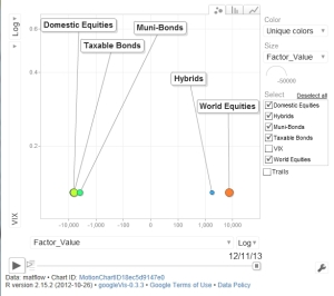
As mentioned in the above the inflows into equities and outflows from bond products are taking place in a relatively low risk environment (as expressed by the VIX).  I find this interesting as it is consistent with an orderly shift in asset allocation. We are not talking about the kind of asset shift we have seen in 2007/2008. It was then clearly driven by a strong risk adversity and therefore not a long lasting proposition. The chart below illustrates well the new flow dynamic we are experiencing.

inflow outflow vix

This kind of configuration tends to occur when an equity bull markets is taking hold. So my view remain stubbornly unchanged and you are better to get used to the above charts….the bloodbath for bonds has just started it will be slow and agonising…I will stay long equity Beta.