Monthly Archives: April 2016

FTSE Break Analysis…

In the following I us an R package BFAST designed to detect structural breaks in time series. The script Iteratively detects breaks in the seasonal and trend component of a time series. The first chart shows the various break and fitted regressions. The second chart shows the deviations from the regression lines and 95% interval of confidence. This could be used as an overbought/oversold indicator. Anyway, just work in progress…so any input / suggestions are always welcome as usual. Feel free to contact me at:Pierre@argonautae.co.uk

plot of chunk plot plot of chunk plot

Minimum Spanning Trees and G10FX implied volatilities…

I have always been keen on clustering methods as they are a practical way to visualise meaningful relationships that may exist in the somehow chaotic financial markets…..So here it is…

The following charts show how major 1-month FX volatilities have been trading over the last 5-years and for 2015.

plot of chunk charts

The folowing charts shows the correlations of daily changes since 2010 and for 2015.

plot of chunk correlation

The below plot the minimum spanning tree for G10FX implied vols. The distance between the nodes being a function of the above correlations. Some groupings are quite intuitive…some other less so…I would say the recent period seems to be at odd with the period 2010-2015 where we had two specific group: one for European currencies the other for commodity currencies….

plot of chunk mst

If you want a natter about this or just to exchange some ideas on the subject or other concepts presented in my blog, contact me at pollux@argonautae.com

Brazil Stock Market Risk Report Update

The following report provides an update on some of the metrics I use to classify market risk. The word classify is more appropriate as I think that in essence you cannot forecast risk but rather attempt to adjust to it into a timely fashion. Clearly risk would not be a risk if you could forecast it accurately. However as there is generally some degree of persistence in risk regimes, using a dynamic classification may be a useful approach for portfolio rebalancing and hedging. In this report I use the CBOE Brazil ETF Volatility Index (VIX Brazil) as a measure of stock market risk for Brazil . The same methodology can be successfully applied to other inputs. Feel free to contact me at pollux@argonautae.com for more information on the subject.

In my approach I recognise that the nominal level of implied volatility is a crude metric of risk therefore I also use two other measures. The VIX Volga, a measure of uncertainty of risk and the ShockIndex a measure of market dislocation. VIX Volga is simply the volatility of the VIX Brazil over a given period. This measure highlights how uncertain and unstable the level of risk has become. Though positively correlated to the level of the VIX Brazil the VIX Brazil Volga is not necessarily dependent on it. You can have a high level of volga whilst the VIX Brazil is trading at rather innocuous levels. This is not a trivial observation as the leverage undertaken by market participants tends to be an inverse function of market volatility which implies a greater vulnerability when volatility becomes uncertain at low levels and therefore cannot be accurately budgeted fo r. The ShockIndex is the ratio between the Volga and VIX at the beginning the historical window chosen to evaluate the Volga. It quantifies sharp changes and acceleration in risk levels. Historically it has proven to be a good classifying measure for market event risks.

The below charts shows those three measures both relative to a time axis and their historical distribution. The red lines are the 95% confidence intervals, the purple line the median. The blue line highlight the current level. The VIX Volga and ShockIndex in this report are evaluated over a period of 14 days. The medians and 95% confidence intervals are calculated over the full history going back to 1990 though the charts shows only the recent years.

plot of chunk riskchart

At close of business the 2016-04-12 the VIX Brazil was trading at 57.8 at the 98.3 percentile. The 14-day VIX Brazil Volga was estimated at 24.7 its 83.1 percentile and the Brazil shockindex at 0.5 or its 41.3 percentile.

The above charts are useful, however their visualisation is quite limiting. On the one hand we need quite a few charts to present the data on the other hand it is difficult to show the full VIX history going back to 1990 as this would make the charts unreadable. Therefore clustering and aggregating the whole data into a single chart should be useful to the end user. To answer this I use a mapping technique developed by Kohonen in the 1980′. It uses an unsupervised neural network to re-arrange data around meaningful clusters. Though computationally complex is a practical way to summarise multidimensional data into a low (usually 2) dimensional system.

The below chart shows how the VIX price history was split into 4 distinct clusters. Those clusters where computed not only as a function of the VIX level but also as a function of the other variables, namely VIX volga and Shockindex.

Since 03/2011 the VIX Brazil traded 59 % of the time in Cluster 1, 20 % in Cluster 2, 3 % in Cluster 3 and 17 % in Cluster 4. Overall the layering provided seems quite intuitive as the increase in risk and time spent in each cluster points toward what would generally be expected from market risk regimes ranging from low to high risk.

plot of chunk cluster_chart

In the chart below we zoom on the various regimes within which the VIX has been trading for the current year. so far it traded 69 % of the time in Cluster 1, 17 % in Cluster 2, 8 % in Cluster 3 and 6 % in Cluster 4.

plot of chunk ytdriskchart

Finally the below chart shows a Self Organising Map of the above mentioned risk metrics. The data has been grouped and colored as a function of four clusters of increasing market risk regimes. Obviously as shown on the map, the minimum level of volatility pertains to cluster 1 and the highest to cluster4. The current regime and its progression from 21 days ago is also highlighted on the map.

plot of chunk SOM_chart

Always happy to discuss any of the above, feel free to reach me at: pollux@argonautae.com

G10 FX Implied Volatilities: Cheap or Expensive ?

The following report provides a granular analysis of implied volatilities within G10 FX. I use primarily the same formatting than for my G10FX positioning report to estimate how extended the 1-month FX implied volatilities are over various time horizon.

The first set of charts shows the historical T-stat of the 1-day changes in 1-month implied volatilities over a rolling period of 61-days. This is my statistical metric to quantify how stretched the implied volatilities are, but clearly other time period could be used as shown further down on in that report. The purple line represents the median value since 1996 and the red lines represent the 95% confidence intervals. Therefore if the value is above or below those the deviation of the given implied volatility should be deemed as atypical relative to what would be expected under a normal distribution (I am not saying that implied volatilities have a normal behaviour to be clear….) and therefore overbought/oversold.

plot of chunk stretch line chart

The below charts shows the current implied volatilities relative to their historical distributions since 1996. Once again the red lines delimit the 95% confidence intervals and the purple line the median value. The blue line indicates the most current level of 1-month implied volatility.

plot of chunk stretch distribution

Finally the below shows a stretch map of the T-Stats to help visualise how much implied volatilities have departed from their equilibrium levels over time horizons ranging from 1-month to 6-month. The bigger the square the most significant the observed upside (Green) or downside (Red) of the implied volatility over the given period.

plot of chunk stretch map

US MUTUAL FUND FLOWS REPORT UPDATE

Wed Apr 13 21:01:50 2016

Fund flows are important as they reflect the general investor preference for a specific asset class given current and expected economic conditions and market risk. They may also highlight non-sustainable market positioning. The ICI in the US tracks about 98% of the inflows and outflows in US mutual funds and makes its data freely available on its website. The following is a summarised report of the data it publishes every Wednesday. The first charts shows the cumulative inflows/outflows in each of the asset classes buckets since 2007

plot of chunk cumulative

During the month of April we have seen flows of US$ -5.29Bn in Domestic equities,US$ -0.555Bn in international equities, US$ 0.373Bn in Hybrid products,US$ 5.21 Bn in taxable bond funds and US$ 1.46Bn in non taxable bond funds.

plot of chunk month to date
The Charts below shows the distribution of the US$ -194Bn that have flowed into US$ Mutual funds over the last 12-month.

plot of chunk distribution

The below charts show the monthly inflows/outflows for each type of fund and plot them both within their 95% confidence intervals and also relative to their historical distribution. This provides a level of information in respect of how “out of line” or not the current month inflows/outflows may be relative to their past history. In the distribution charts The current month is highlited in blue whereas the vertical red lines represent the 95% confidence intervals.

plot of chunk flowdistribution

The chart below plot the inflows/outflows T-statistics for each of the funds cathegories considered. The Map chart provides information for period ranging from 2 years to 3 months.The greater the square the more important the inflows (green) outflows(red) over a given period.

plot of chunk flowmap

G10 FX Risk Report Update

The following analysis uses a proprietary G10 FX implied volatility index which I created quite a few years ago. The index is a G10 FX 1-month implied volatility index which weights are derived from the BIX FX triennal surveys for the year 2001,2003 & 2007. If you want more information on the exact formulation of the index feel free to contact me pollux@argonautae.com for a chat. For the time being suffice to say that the G10 FX volatility index is a broad and accurately weighted measure of G10 FX risk.

In my approach I recognise that the nominal level of implied volatility is a crude metric of risk therefore I also use two other measures, namely Volga and the ShockIndex. The Volga is simply the volatility of the G10 FX volatility index over a given period. This measure highlights how uncertain and unstable the level of risk in G10 FX has become. Though generally positively correlated those measures of risk can diverge from time to time. You can have a high level of volga whilst G10 FX volatilities are trading at rather innocuous levels. This is not a trivial observation as the leverage undertaken by market participants tends to be an inverse function of market volatility which implies a greater vulnerability when volatility becomes uncertain at low levels and therefore cannot be accurately budgeted for. The ShockIndex is the ratio between the Volga and the G10 FX volatility index at the beginning the historical window chosen to evaluate the Volga. It quantifies sharp changes and acceleration in risk levels. Historically it has proven to be a good classifying measure for market event risks in FX markets.

The below charts shows those three measures both relative to a time axis and their historical distribution. The red lines are the 95% confidence intervals, the purple line the median. The blue line highlight the current level. The Volga and ShockIndex in this report are evaluated over a period of 14 days. The medians and 95% confidence intervals are calculated over the full history going back to 1996 though the charts shows only the recent years.

plot of chunk riskchart

At close of business the 2016-04-12 the G10 FX volatility index was estimated at 7.8 % at the 54.2 percentile. The 14-day G10 FX Volga was estimated at 4.4 % its 63.3 percentile and the shockindex at 0.5 or its 60.2 percentile.

The above charts are useful, however their visualisation is quite limiting. On the one hand we need quite a few charts to present the data on the other hand it is difficult to show the full G10 FX volatility Index history going back to 1996 as this would make the charts unreadable. Therefore clustering and aggregating the whole data into a single chart should be useful to the end user. To answer this I use a mapping technique developed by Kohonen in the 1980′. It uses an unsupervised neural network to re-arrange data around meaningful clusters. Though computationally complex is a practical way to summarise multidimensional data into a low (usually 2) dimensional system.

The below chart shows how the G10 FX Volatility Index history was split into 4 distinct clusters. Those clusters where computed not only as a function of the G10 FX Volatility Index level but also as a function of the other discussed variables, namely Volga and Shockindex.

Since 1996 the G10 FX volatility Index traded 62 % of the time in Cluster 1, 27 % in Cluster 2, 8 % in Cluster 3 and 3 % in Cluster 4. Overall the layering provided seems quite intuitive as the increase in risk and time spent in each cluster points toward what would generally be expected from market risk regimes ranging from low to high risk.

plot of chunk cluster_chart

In the chart below we zoom on the various regimes within which the G10 FX Volatility Index hasevolved for the current year. so far it remained 68 % of the time in Cluster 1, 22 % in Cluster 2, 10 % in Cluster 3 and 0 % in Cluster 4.

plot of chunk ytdriskchart

Finally the below chart shows a Self Organising Map of the above mentioned risk metrics. The data has been grouped and colored as a function of four clusters of increasing market risk regimes. Obviously as shown on the map, the minimum level of volatility pertains to cluster 1 and the highest to cluster4. The current regime and its progression from 21 days ago is also highlighted on the map.

plot of chunk SOM_chart

Emerging Stock Market Risk Report Update

The following report provides an update on some of the metrics I use to classify market risk. The word classify is more appropriate as I think that in essence you cannot forecast risk but rather attempt to adjust to it into a timely fashion. Clearly risk would not be a risk if you could forecast it accurately. However as there is generally some degree of persistence in risk regimes, using a dynamic classification may be a useful approach for portfolio rebalancing and hedging. In this report I use the CBOE Emerging markets ETF Volatility Index (VIX Emerging markets) as a measure of Emerging stock markets risk. The same methodology can be successfully applied to other inputs. Feel free to contact me at Pierre@argonautae.com for more information on the subject.

In my approach I recognise that the nominal level of implied volatility is a crude metric of risk therefore I also use two other measures. The VIX Volga, a measure of uncertainty of risk and the ShockIndex a measure of market dislocation. VIX Volga is simply the volatility of the VIX Emerging markets over a given period. This measure highlights how uncertain and unstable the level of risk has become. Though positively correlated to the level of the VIX Emerging markets the VIX Emerging markets Volga is not necessarily dependent on it. You can have a high level of volga whilst the VIX Emerging markets is trading at rather innocuous levels. This is not a trivial observation as the leverage undertaken by market participants tends to be an inverse function of market volatility which implies a greater vulnerability when volatility becomes uncertain at low levels and therefore cannot be accurately budgeted fo r. The ShockIndex is the ratio between the Volga and VIX at the beginning the historical window chosen to evaluate the Volga. It quantifies sharp changes and acceleration in risk levels. Historically it has proven to be a good classifying measure for market event risks.

The below charts shows those three measures both relative to a time axis and their historical distribution. The red lines are the 95% confidence intervals, the purple line the median. The blue line highlight the current level. The VIX Volga and ShockIndex in this report are evaluated over a period of 14 days. The medians and 95% confidence intervals are calculated over the full history going back to 1990 though the charts shows only the recent years.

plot of chunk riskchart

At close of business the 2016-04-12 the VIX Emerging markets was trading at 22.6 at the 43.4 percentile. The 14-day VIX Emerging markets Volga was estimated at 11.5 its 8.2 percentile and the Emerging markets shockindex at 0.5 or its 8.9 percentile.

The above charts are useful, however their visualisation is quite limiting. On the one hand we need quite a few charts to present the data on the other hand it is difficult to show the full VIX history going back to 1990 as this would make the charts unreadable. Therefore clustering and aggregating the whole data into a single chart should be useful to the end user. To answer this I use a mapping technique developed by Kohonen in the 1980′. It uses an unsupervised neural network to re-arrange data around meaningful clusters. Though computationally complex is a practical way to summarise multidimensional data into a low (usually 2) dimensional system.

The below chart shows how the VIX price history was split into 4 distinct clusters. Those clusters where computed not only as a function of the VIX level but also as a function of the other variables, namely VIX volga and Shockindex.

Since 03/2011 the VIX Emerging markets traded 49 % of the time in Cluster 1, 35 % in Cluster 2, 9 % in Cluster 3 and 7 % in Cluster 4. Overall the layering provided seems quite intuitive as the increase in risk and time spent in each cluster points toward what would generally be expected from market risk regimes ranging from low to high risk.

plot of chunk cluster_chart

In the chart below we zoom on the various regimes within which the VIX has been trading for the current year. so far it traded 62 % of the time in Cluster 1, 35 % in Cluster 2, 4 % in Cluster 3 and 0 % in Cluster 4.

plot of chunk ytdriskchart

Finally the below chart shows a Self Organising Map of the above mentioned risk metrics. The data has been grouped and colored as a function of four clusters of increasing market risk regimes. Obviously as shown on the map, the minimum level of volatility pertains to cluster 1 and the highest to cluster4. The current regime and its progression from 21 days ago is also highlighted on the map.

plot of chunk SOM_chart

Always happy to discuss any of the above, feel free to reach me at: Pierre@argonautae.co.uk

Chinese Stock Market Risk Report Update

The following report provides an update on some of the metrics I use to classify market risk. The word classify is more appropriate as I think that in essence you cannot forecast risk but rather attempt to adjust to it into a timely fashion. Clearly risk would not be a risk if you could forecast it accurately. However as there is generally some degree of persistence in risk regimes, using a dynamic classification may be a useful approach for portfolio rebalancing and hedging. In this report I use the CBOE China ETF Volatility Index (VIX China) as a measure of stock market risk for China . The same methodology can be successfully applied to other inputs. Feel free to contact me at Pierre@argonautae.com for more information on the subject.

In my approach I recognise that the nominal level of implied volatility is a crude metric of risk therefore I also use two other measures. The VIX Volga, a measure of uncertainty of risk and the ShockIndex a measure of market dislocation. VIX Volga is simply the volatility of the VIX China over a given period. This measure highlights how uncertain and unstable the level of risk has become. Though positively correlated to the level of the VIX China the VIX China Volga is not necessarily dependent on it. You can have a high level of volga whilst the VIX China is trading at rather innocuous levels. This is not a trivial observation as the leverage undertaken by market participants tends to be an inverse function of market volatility which implies a greater vulnerability when volatility becomes uncertain at low levels and therefore cannot be accurately budgeted fo r. The ShockIndex is the ratio between the Volga and VIX at the beginning the historical window chosen to evaluate the Volga. It quantifies sharp changes and acceleration in risk levels. Historically it has proven to be a good classifying measure for market event risks.

The below charts shows those three measures both relative to a time axis and their historical distribution. The red lines are the 95% confidence intervals, the purple line the median. The blue line highlight the current level. The VIX Volga and ShockIndex in this report are evaluated over a period of 14 days. The medians and 95% confidence intervals are calculated over the full history going back to 1990 though the charts shows only the recent years.

plot of chunk riskchart

At close of business the 2016-04-11 the VIX China was trading at 28.9 at the 68.7 percentile. The 14-day VIX China Volga was estimated at 10.2 its 19.9 percentile and the China shockindex at 0.3 or its 5.3 percentile.

The above charts are useful, however their visualisation is quite limiting. On the one hand we need quite a few charts to present the data on the other hand it is difficult to show the full VIX history going back to 1990 as this would make the charts unreadable. Therefore clustering and aggregating the whole data into a single chart should be useful to the end user. To answer this I use a mapping technique developed by Kohonen in the 1980′. It uses an unsupervised neural network to re-arrange data around meaningful clusters. Though computationally complex is a practical way to summarise multidimensional data into a low (usually 2) dimensional system.

The below chart shows how the VIX price history was split into 4 distinct clusters. Those clusters where computed not only as a function of the VIX level but also as a function of the other variables, namely VIX volga and Shockindex.

Since 03/2011 the VIX China traded 43 % of the time in Cluster 1, 35 % in Cluster 2, 12 % in Cluster 3 and 10 % in Cluster 4. Overall the layering provided seems quite intuitive as the increase in risk and time spent in each cluster points toward what would generally be expected from market risk regimes ranging from low to high risk.

plot of chunk cluster_chart

In the chart below we zoom on the various regimes within which the VIX has been trading for the current year. so far it traded 68 % of the time in Cluster 1, 32 % in Cluster 2, 0 % in Cluster 3 and 0 % in Cluster 4.

plot of chunk ytdriskchart

Finally the below chart shows a Self Organising Map of the above mentioned risk metrics. The data has been grouped and colored as a function of four clusters of increasing market risk regimes. Obviously as shown on the map, the minimum level of volatility pertains to cluster 1 and the highest to cluster4. The current regime and its progression from 21 days ago is also highlighted on the map.

plot of chunk SOM_chart

Always happy to discuss any of the above, feel free to reach me at: Pierre@argonautae.co.uk

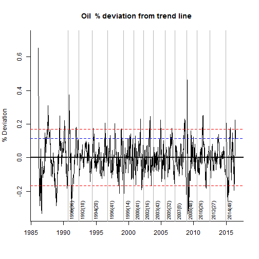
Oil Break Analysis…

In the following I us an R package BFAST designed to detect strucutural breaks in time series.The script Iteratively detects breaks in the seasonal and trend component of a time series. The first chart shows the various break and fitted regressions. The second chart shows the deviations from the regression lines and 95% interval of confidence. This could be used as an overbought/oversold indicator. Anyway, just work in progress…so any input / suggestions are always welcome as usual. Feel free to contact me at:Pierre@argonautae.com

plot of chunk plot plot of chunk plot

Oil update….

Whatever the market being traded, there always will be a a question being asked at one moment: How far can this thing go ? Clearly not an easy question to answer as this will invariably depends on factors that are partly unknown or difficult to estimate, such as fundamentals, market positioning or market risk amongst others. The first part is obviously to assess how atypical the move experienced in the given instrument is. This report aims to contribute to this.

The below chart shows the WTI Spot Price over the period of January 1986 to April 2016 . On the 12 April 2016 it was trading around 42.16.

plot of chunk chartdata

In the below I plot the previous 125 days against other similar historical periods that would have closely matched the recent history. The data has been normalised so as to be on the same scale. The chart shows the latest 125 days in black, and overlay similar historical patterns in grey. It Also shows what has been the price path for the following 125 days as well as the observed quartiles.

plot of chunk pattern

Finally I plot the last 125 days and a trend forecast derived from an ARIMA(0,1,2) model as well as the 95% confidence intervals. The ARIMA model is fitted to the past 625 historical values whilst ignoring the last 125 days, therefore we can look at the recent price path against the trend forecast and its confidence intervals to gauge how (a)typical the recent move has been.

plot of chunk arimaplot